jl
Member  Inactive
Posts: 142 
|
Post by jl on Dec 13, 2016 23:40:30 GMT
Genuine stamp on left.The following applies to all 491 basic,surcharges, & Offices in China issues. Perf. 14 x 13 1/2 Hand on staff has well defined fingers. Mars has a belly button. The cornucopia on upper right has the lower most fruit on the left side separated & distinct from the rim of the cornucopia Forgery on the right. Perf. 13x1/2 to 13x3/4 x14 Hand on staff is a blur. Mars lost his belly button. The fruit looks like a bump on the rim of the cornucopia. Hope this helps.John 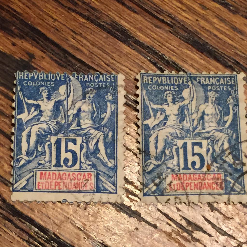 |
|
|
|
Post by jkjblue on Dec 14, 2016 0:03:19 GMT
Thanks John.
They look like Charles Hirschburger Forgeries (1917-23) to me.
falschung, what do you think?
|
|
Deleted
Deleted Member
Posts: 0
|
Post by Deleted on Dec 14, 2016 2:38:47 GMT
I have not spent much time on these issues so I can only offer an opinion. The genuine Navigation & Commerce are perfed 14 X 13.5 Fournier forgeries were perfed 12 and aside from the mentioned differences, the perfs were generally poor especially in the corners. If one looks at the letters especially in "FRANCAISE", there are numerous differences. After Fournier's death in 1917, his assistant Hirschburger continued the business (unsuccessfully) until 1927 when the remaining stocks were sold to the Geneva Philatelic Union. I have not seen any difference between the Fournier & Hirshburger other than the perfs being 13.5 X 14 Fournier made the stamps in imperforate sheets with one denomination and all the countries. He also made sheets with one denomination and one country. My theory would be that Hirshburger tried to fix one of the issues by modifying the perforations. Fournier also had the tendency to offer stamps as first and second choice. The 2nd choice ones may have been made by other forgers. The forgery community was very close and often worked together. Lastly, these stamps are now showing up as modern forgeries. They are quite good other than the perfs (corners), some color variations, modern paper, differences in the country font and sometimes with printers marks as shown below.  The M of "MOHELI" has a short middle leg. See French Colonies Primer |
|
jl
Member
Inactive
Posts: 142
|
Post by jl on Dec 20, 2016 0:24:09 GMT
Thanks again falsching.I had forgotten about the small openings in the R P B of republic.Also the perfs. in opposite corners are different.
Agree that these are Hirschburger forgeries.John
|
|


