firstfrog2013
Member 
Posts: 3,276  What I collect: BNA Liberia St Pierre U.S. Bolivia Turkey
|
Post by firstfrog2013 on Jun 28, 2017 2:12:07 GMT
This thread opened for posting of the other print errors. I waited til price stabilized a bit before purchasing this one (always a gamble).Year 2007 #2201 and 2201a missing gold foil.  |
|
Ryan
Member
Calgary, Alberta, Canada
Posts: 2,720
What I collect: If I have a catalogue for it, I collect it. And I have many catalogues ....
|
Post by Ryan on Jun 28, 2017 7:41:40 GMT
Here are a couple I've posted quite a while ago - the image properties say December 2013. First, the "White Queen", the 1978 14c Queen Elizabeth II definitive missing the red colour and the tagging, next to a normal stamp. There exist some transitional copies missing varying amounts of the red, from most of the red being present to most of it missing.  Next, an imperforate pair from Canada's 1974 telephone centenary commemorative. One sheet of 50 stamps has been reported imperforate. I have a collection of Canadian imperforate stamps, and this is certainly at the pointy end for me as far as rarity and catalogue value are concerned. Canada is one of at least three countries which lays claim to Alexander Graham Bell - he was a Scot whose professorial career was in the US but he was at his summer home in Canada when he made his first telephone call. Other Americans also laid claim to being the inventor of the telephone, as did an Italian. But then Germany has a completely different guy they consider to be the inventor of the telephone. Whatever the case may be, I only have an imperforate pair related to Alexander Graham Bell. ha ha  Ryan |
|
Ryan
Member
Calgary, Alberta, Canada
Posts: 2,720
What I collect: If I have a catalogue for it, I collect it. And I have many catalogues ....
|
Post by Ryan on Jun 28, 2017 9:15:40 GMT
The 1979 $2 Kluane National Park definitive has a Unitrade catalogue listing for copies with the black printing doubled. As of the year of my catalogue, only 2 used copies were known and the catalogue value is accordingly quite high. However, I've found 4 copies in my own piles of stuff after only a partial search and I'm sure there are still more yet to be found. Granted, my copies don't show the same level of separation between the main black print and the ghost print as is illustrated in the catalogue, but it's visible enough that I could spot it with just a magnifying lens. Here are two examples with a relatively easy-to-see ghost print. The images shown were taken with a digital microscope (the full stamp image was nabbed from the Canada Postal Archives website).    I'm sure there is debate as to what is rightfully considered a "double print" and what should be considered a "ghost print" or a "kiss print". The Unitrade catalogue unfortunately isn't real consistent in that regard. Have a look at the listing for the 1970 Christmas issue to see a copy of what is listed as a "triple print" but which is clearly much fainter on the extra impressions - it's not a case where the stamp was printed 3 times with a fresh re-inking each time, but rather the plate was inked a single time and used to make 3 printed impressions, leaving the inking far weaker on the extra impressions (as is the case with my copies above). Ryan |
|
Anping
Departed
Rest in Peace
Posts: 533
What I collect: Hong Kong, Aden & States & odd stuff I like.
|
Post by Anping on Jun 28, 2017 16:36:04 GMT
I'm sure there is debate as to what is rightfully considered a "double print" and what should be considered a "ghost print" or a "kiss print". And this is an issue which has confounded me for some time. The numerous reference books I have, often refer to 'kiss prints'. Indeed I have seen a number of certificates dismissing doubles as kiss prints. Yet I have still to find a definitive explanation of what that means exactly. I have my own ideas, but I would prefer to see a precise description from someone with printing experience who actually knows what the difference is between a double print and a kiss print, and how they come about. |
|
Ryan
Member
Calgary, Alberta, Canada
Posts: 2,720
What I collect: If I have a catalogue for it, I collect it. And I have many catalogues ....
|
Post by Ryan on Jun 29, 2017 16:21:22 GMT
I very seldom come across anything of note that's too different from the norm in the mountains of kiloware I've bought. The stuff that's hard to spot turns up fairly often, like plate varieties or missing tagging or kiss prints, but something like this misperforation is really rare for me. This is the only Canadian stamp like this that I've ever managed to come across "in the wild". I see similar things listed all the time from dealers and at auction, and if I wanted a collection of them I guess I'd just buy some, but I sure never see them otherwise.  Ryan |
|
brightonpete
Departed
Rest in Peace
On a hike at Goodrich-Loomis
Posts: 5,110
|
Post by brightonpete on May 28, 2018 13:33:02 GMT
I specialized in Canadian Definitives, starting with the 1967-73 Centennials. The next were the Caricatures & Landscapes, which was a very interesting set with all the varieties available. I picked up a few errors along the way, way back then... A large blob of ink mars this strip of three picturing a Prairie street.
A ghost print block of four. Must be a Saskatchewan ghost town!
A print shift to the left of this Toronto street scene.
A downward print shift.
And then there is this little gem. Looks perfectly fine to me, except they printed it on the gummed side.
Which my Unitrade 2016 catalog prices it at $1,250! Who in their right mind would pay THAT much for this error?
I guess someone would. |
|
Bombadil
Member
Posts: 465
What I collect: Worldwide stamps 1840-1960
|
Post by Bombadil on May 28, 2018 15:08:19 GMT
I specialized in Canadian Definitives, starting with the 1967-73 Centennials. The next were the Caricatures & Landscapes, which was a very interesting set with all the varieties available. I picked up a few errors along the way, way back then...
And then there is this little gem. Looks perfectly fine to me, except they printed it on the gummed side.
Which my Unitrade 2016 catalog prices it at $1,250! Who in their right mind would pay THAT much for this error?
I guess someone would.
|
|
firstfrog2013
Member
Posts: 3,276
What I collect: BNA Liberia St Pierre U.S. Bolivia Turkey
|
Post by firstfrog2013 on Nov 18, 2018 1:26:35 GMT
Well I thought I'd post the inglorious presentation of my seaway invert.As usual it is placed where it belongs in the collection.Perhaps a little too subtle for some but correct none the less..  |
|
|
|
Post by dgdecker on Nov 18, 2018 4:07:46 GMT
Firstfrog,
i was nine or ten when I became aware of the Seaway invert. For the next few years I was obsessed with finding one or any other error. One I found out how pricy it would be o acquire, my interest dropped off. At least for the next ten years I collected any stamp. I still spent hours searching and hoping I might find something. No luck, but I still check any Canadian stamps I get, just in case. I do same for other countries I collect . I do set aside anything that looks « different » to me. So far have only found items where there has been a colour change over the years. I will keep looking. Never give up I tell myself. Thank you so much for posting the inverts.
david
|
|
firstfrog2013
Member
Posts: 3,276
What I collect: BNA Liberia St Pierre U.S. Bolivia Turkey
|
Post by firstfrog2013 on Nov 18, 2018 12:40:53 GMT
Good for you David. The discovery of any variety is done just the way you are doing. I too look at everything that passes through my hands. I to date have found numerous high CV items by routinely measuring perfs,watermarking and louping most items.
When looking at lots online examine all provided pictures very carefully.Use any means you may know to blow them up and look not only at condition but any abnormalities.Always consider that what you think you see may or may not actually be present.Your hopeful mind can over power your common sense.
Consider no one would have found stitch watermarks without someone actually watermarking more common stamps.
|
|
Beryllium Guy
Moderator 
Posts: 5,654
What I collect: Worldwide Stamps 1840-1930
|
Post by Beryllium Guy on Nov 18, 2018 13:22:02 GMT
Well I thought I'd post the inglorious presentation of my seaway invert. As usual it is placed where it belongs in the collection. Perhaps a little too subtle for some but correct none the less.. Frog, thank you so much for posting this image of your Seaway invert--fabulous stuff! I have never had a single stamp in my collection with such a high CV. It is seriously cool that you have that, and I love seeing it right where it belongs.... perfect. Thanks for sharing that! And bravo to David ( dgdecker ) for continuing to look for one. I hope that you will find one in some unexpected place one day. That's always been a dream of mine, too, to find a true rarity in a totally unexpected place where it has gone undetected for years....  |
|
renden
Member
Posts: 8,705
What I collect: World W collector with ++ interests in BNA (Canada etc) and USA
|
Post by renden on Nov 18, 2018 19:46:09 GMT
Well I thought I'd post the inglorious presentation of my seaway invert.As usual it is placed where it belongs in the collection.Perhaps a little too subtle for some but correct none the less.. Your Seaway Inverted 387a is shown in my Unitrade with text inverted (and not the face).....now this is quite confusing !! Yours is the real inverted as my late father bought it, with face inverted (blue).not the text......I just turned and looked at my Stamp room wall to see the picture of my father's 387a. Still wonder about Unitrade ?? Congrats firstfrog2013 René This is a pic (enlarged by my father, laminated) with a photo included of his cherish Seaway Inverted....the real one being in a safety deposit box at BMO, at the time  |
|
Beryllium Guy
Moderator
Posts: 5,654
What I collect: Worldwide Stamps 1840-1930
|
Post by Beryllium Guy on Nov 18, 2018 21:44:13 GMT
Well I thought I'd post the inglorious presentation of my seaway invert. As usual it is placed where it belongs in the collection. Perhaps a little too subtle for some but correct none the less.. Your Seaway Inverted 387a is shown in my Unitrade with text inverted (and not the face).....now this is quite confusing !! Yours is the real inverted as my late father bought it, with face inverted (blue).not the text......I just turned and looked at my Stamp room wall to see the picture of my father's 387a. Still wonder about Unitrade ?? René, thank you very much for your posts on this great subject, the famous Seaway Invert. It's great to know that your father had one, and that Frog ( firstfrog2013) has one, too. I noticed that you commented about inverted face versus inverted text, but think about that for a moment. In an invert, the frame and the center (vignette) are inverted relative to each other. So, although I agree that Scott may choose to distinguish the invert from the normal version by calling it "center inverted", they could have just as easily called it "frame inverted" or "lettering inverted", I think. I have borrowed an image of another Seaway invert from the Internet, and I have placed next to it, the exact same image of the exact same stamp, only upside down. So, the first one is "center inverted" and the second is "lettering inverted" but in fact, it is the same stamp. Personally, I feel that the wording in the catalogue makes it confusing, as there are multiple expressions possible to describe the same stamp. Does that help at all? Whichever way you decide to call it, it is a fascinating and rare item of philately, and I think it is great that you and Frog both have a personal connection to the whole thing.   |
|
|
|
Post by dgdecker on Nov 18, 2018 22:21:41 GMT
Good for you David. The discovery of any variety is done just the way you are doing. I too look at everything that passes through my hands. I to date have found numerous high CV items by routinely measuring perfs,watermarking and louping most items. When looking at lots online examine all provided pictures very carefully.Use any means you may know to blow them up and look not only at condition but any abnormalities.Always consider that what you think you see may or may not actually be present.Your hopeful mind can over power your common sense. Consider no one would have found stitch watermarks without someone actually watermarking more common stamps. Frog, i will never give up the hunt. I have not found that invert, but I have discovered many little treasures. Some I have had for thirty years and have recently « discovered » stuffed between pages of books. So I did a search through my library. I think I was using my books as a vault in those days. Not huge values but they filled holes in the collection. I am now taking more time to look closer at stamps to educate myself and to be aware of what to look for. never too late to learn new things. thanks for the encouragement. David |
|
renden
Member
Posts: 8,705
What I collect: World W collector with ++ interests in BNA (Canada etc) and USA
|
Post by renden on Nov 18, 2018 22:48:20 GMT
|
|
stanley64
Member
Posts: 1,818
What I collect: Canada, USA, Netherlands, Portugal & Colonies, Antarctic Territories and anything that catches my eye...
|
Post by stanley64 on Sept 19, 2019 8:17:33 GMT
Here is an interesting, albeit rather common error; the blue feather variety (on the woman)...
There are various mis-registrations on this stamp (Scott No.569) due to the turquoise blue being shifted.
|
|
stanley64
Member
Posts: 1,818
What I collect: Canada, USA, Netherlands, Portugal & Colonies, Antarctic Territories and anything that catches my eye...
|
Post by stanley64 on Oct 23, 2019 8:34:07 GMT
Colour shifts: variety, oddity or simply a philatelic curiosity? In addition to colour shifts seen in the printing of the red (land masses) and blue (seas & oceans) plates found on Canada's map stamps (Scott No. 85 & 86), the turquoise blue shift seen on (Scott No.569) shared earlier in this thread, here is another; this time from the Canada's Definitive series of 1972 - 1978 featuring the skyline of Vancouver and its mis-registration of the green ink.
1$ Vancouver (Scott No.600) Perforation 11 x 11, 12.5 x 12, 13.5 x 13.5 & issued on 17 March, 1972 with printings by the British American Bank Note Company.
close-up of green-ink shift to the left
These are nice to have in one's collection and certainly a joy to come across when sorting through a pile of stamps, but are there worthy of a premium? After all they are not true errors such as omitting a colour altogether, a mis-perforation, or even a re-entry. Instead, as there veer from the original intent of the artist and printer, I would classify them in the curiosity category and would not expect to pay a high or even exorbitant premium to add such an item to the collection as nice as they are to find and have... |
|
Ryan
Member
Calgary, Alberta, Canada
Posts: 2,720
What I collect: If I have a catalogue for it, I collect it. And I have many catalogues ....
|
Post by Ryan on Oct 25, 2019 3:13:51 GMT
These are nice to have in one's collection and certainly a joy to come across when sorting through a pile of stamps, but are there worthy of a premium?
The Darnell catalogue used to list quite a few of this sort of thing, small colour shifts (like your "blue feather" Algonkians stamp shown a bit earlier) which result is some sort of recognizable feature ("hair touching barn", "big wave", "missing shoreline", stuff they could name somehow). At some point in time, the Unitrade catalogue had made a point that these small colour shifts were not going to be recognized in their catalogue so the listings were removed. For the most part, that is - I see that the "Siamese bears" variety is still in my 2018 edition, as are a couple others, some with listing numbers, others unnumbered but still priced (like the "hair touching barn" Welland Canal variety). The Darnell catalogue always seemed to me to be highly optimistic about the value of such things - my 2005 edition (their last, I think?) prices your "blue feather" stamp at CAN $10 mint. To me, the 60 cent street scene definitive shown by brightonpete earlier in this thread is the kind of misprint that's worthy of note. Small colour shifts are just poor printing, one colour off-centre relative to the others. It seems to me that it should be like a poorly centred stamp - when it's something where the design is up against the perforations on one side and there's a big margin on the opposite side, it looks homely and it's hardly the copy I'd want to keep. If the centering is so monumentally bad that the perforations run across the middle of the design, then it's something I would like in my collection. (Siamese bears, for those wondering what I'm talking about - image nabbed from the Arpin Philately website.)  Ryan |
|
WERT
Departed
Rest in Peace
Posts: 1,062
What I collect: Canada and Provinces
|
Post by WERT on Nov 1, 2019 14:54:40 GMT
Here is an oddity, maybe not a print error, but who knows. Scott 352 with "C" (cents) before the "4" denomination.. The only Canada stamp with that oddity.
Robert
 |
|
brightonpete
Departed
Rest in Peace
On a hike at Goodrich-Loomis
Posts: 5,110
|
Post by brightonpete on Nov 1, 2019 15:09:24 GMT
Here is an oddity, maybe not a print error, but who knows. Scott 352 with "C" (cents) before the "4" denomination. The only Canada stamp with that oddity. I call that "artists perogative"! It just fit with the design. |
|
renden
Member
Posts: 8,705
What I collect: World W collector with ++ interests in BNA (Canada etc) and USA
|
Post by renden on Nov 1, 2019 15:10:40 GMT
Robert WERT - my Mint copy looks the same with the ¢ before the numeral - René - do believe the 4¢ Musk Ox was issued that way as designed by Emmanuel Otto Hahn |
|
|
|
Post by pilot on Apr 21, 2020 3:49:35 GMT
Cook Islands
1932 2½d. dark ultramarine and black with centre inverted
SG102 var.
 |
|
|
|
Post by pilot on Apr 21, 2020 3:52:14 GMT
Cook Islands
1932 2d. brown with centre inverted
SG101 var.
 |
|
|
|
Post by jimjung on Nov 15, 2020 13:29:01 GMT
|
|
renden
Member
Posts: 8,705
What I collect: World W collector with ++ interests in BNA (Canada etc) and USA
|
Post by renden on Dec 4, 2020 19:42:33 GMT
History by a stamp with errors - Scott 981 32¢ issued June 28, 1983 for the Edmonton, Canada, Universiade "83 These specimens were found in the collection (WW) given to me some 2 weeks ago by a friend. They are the original work of Hugho Daigle, a late philatelist from Edmundston and nothing has been re-touched by me. One will observe his remarks re: 1) distorted head 2) yellow and blue lines of continuity of right+left hand+head 3) blue line over the hea miixed with the green portion.......2+ oddities not mentioned in Unitrade Canada Specialized. A real printing miss !! Also a brief history by handwriting (in french and english) with CANCEL 29 VI 1983, while the stamp was issued on the 28th but the first date of sale was the 29th !! submitting to WERT , my Ontario flyspecker friend. Original specimen 981 without errors Finally, history of a diver from Georgia hitting the Board, and dying of his injury afterwards in an Edmonton Hospital The 2 specimens: 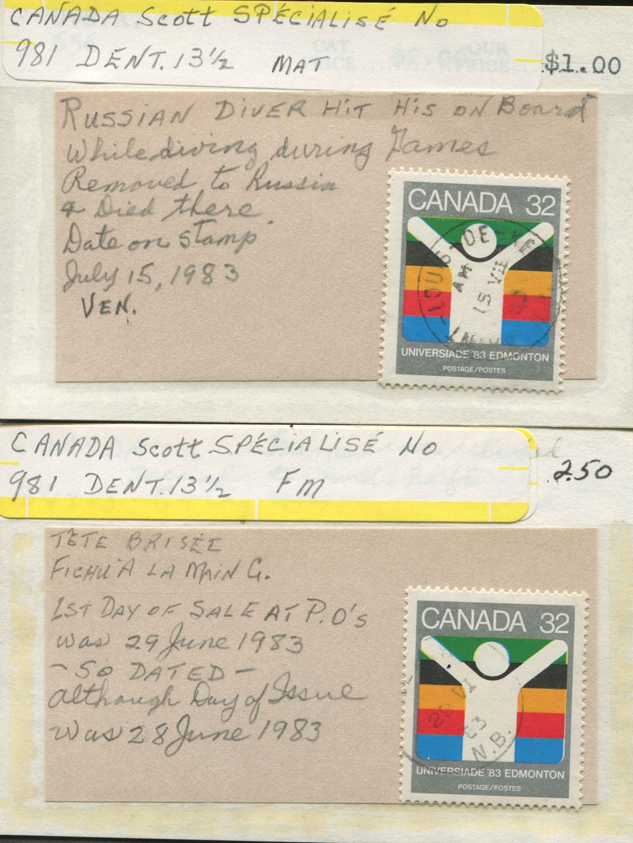 Specimen without error: 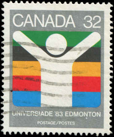 History of Diving Accident (ref Wikepedia) Sergei Chalibashvili (Georgian: სერგო შალიბაშვილი; Russian: Шалибашвили Сергей; June 22, 1962 – July 16, 1983) was a Georgian competitive diver from the Soviet Union. He earned a silver medal at the European Youth Championship in 1978 in Florence, diving from the 10-meter diving platform. Death Chalibashvili died at the age of 21 following an accident during competition at the 1983 Summer Universiade in Edmonton, Alberta, when he hit his head on the platform while attempting a reverse 3½ somersault in the tuck position. He fell into a week-long coma and subsequently died of heart failure, never having regained consciousness.[1][2] |
|
renden
Member
Posts: 8,705
What I collect: World W collector with ++ interests in BNA (Canada etc) and USA
|
Post by renden on Jan 19, 2023 15:54:58 GMT
This thread has been inactive since Dec 2020 Here is an "oddity" on Unitrade's 607 8¢ stamp - I call it "moon" - not described in the Canadian Cat René WERT is no longer with us to comment..... 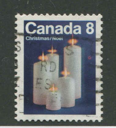 |
|
Admin
Administrator 
Posts: 2,637
|
Post by Admin on Jan 19, 2023 16:44:46 GMT
|
|
renden
Member
Posts: 8,705
What I collect: World W collector with ++ interests in BNA (Canada etc) and USA
|
Post by renden on Jan 19, 2023 16:55:37 GMT
Yes and so did I (comment), Admin - thanks for getting us to this thread - in fact this is not a variety (ref: Unitrade 2023 Canadian Specialized cat.) I do like Wert's opinion of naming it a different name. Wert and I exchanged many varieties (not this name)- he was a super guy ! I sill miss him. René |
|


