|
|
Post by jamesw on Dec 1, 2013 4:28:27 GMT
Hello all! I need your input here. My stamp club is holding a 'one page exhibit' night at our meeting in two weeks, and I've spent this evening throwing this together. I'd love to hear your ideas on how to improve it. The challenge here, of course, is putting a coherent exhibit together in the limited space of a single page. Luckily I've been looking into the Canadian War Tax stamps for a while now, so I figured I'd be able to make some sense of it. This also allows me to get a head start on a larger exhibit for next year's club bourse. So have a look, and be brutal. Constructive criticism is always welcome. Thanks in advance. 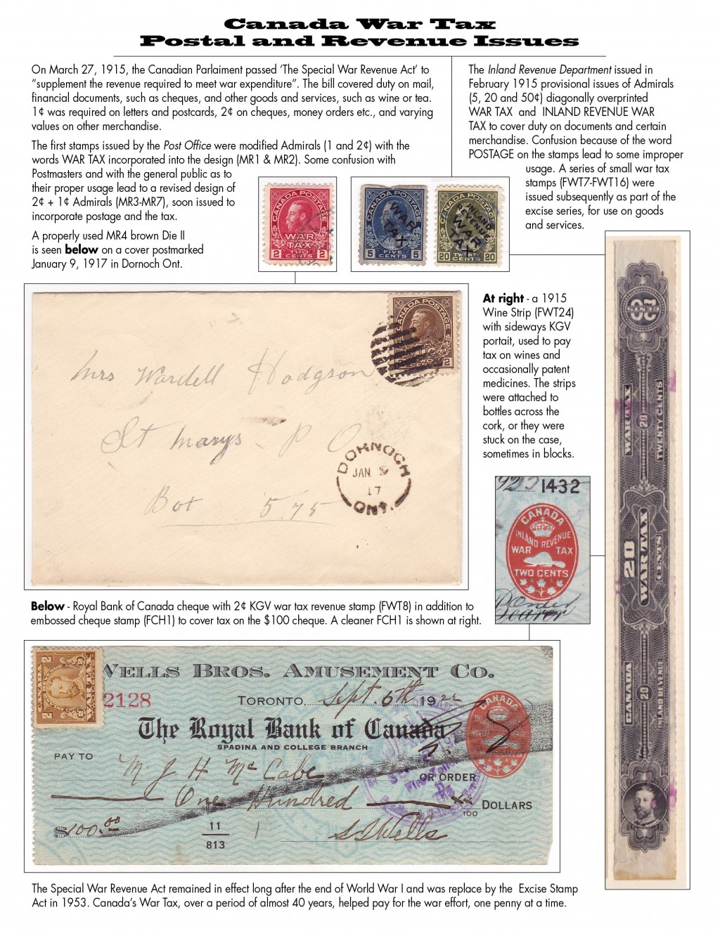 |
|
rod222
Member 
Posts: 9,875  What I collect: Worldwide Stamps, Ephemera and Catalogues
Member is Online
What I collect: Worldwide Stamps, Ephemera and Catalogues
Member is Online
|
Post by rod222 on Dec 1, 2013 10:16:01 GMT
As an observer wearing my "stamp collector" hat, I think the piece has been done beautifully, easy to read, lovely font, and construction,
being pushed I would give a demerit to stamps not entirely vertical, and the 5c damaged (difficult replacement understood)
It looks as if it has come off a magazine article, I envy your expertise.
With larger pieces, I like to see "Fig 1" etc, under each image with reference to the Fig number contained in the text.
9.75/10 Super stuff.
|
|
Ryan
Member
Calgary, Alberta, Canada
Posts: 2,720
What I collect: If I have a catalogue for it, I collect it. And I have many catalogues ....
|
Post by Ryan on Dec 1, 2013 11:23:30 GMT
I see some typos that can be fixed. "Parlaiment" is misspelled, it should be "Parliament". The past tense of "lead" is correctly spelled "led" ("Some confusion with Postmasters ..." and "Confusion because of the word POSTAGE ..."). The second "r" in "portrait" is missing ("... with sideways KGV portait"). In the last paragraph, the word "replace" is missing the final "d", it should read "replaced". And according to style guides, place names need a comma between the town and province (should read "Dornoch, Ont.").
Stylistically, I'm with Rod, it looks very good to me. If I were a layout editor, maybe the only thing I would change would be the width on the title font - I have trouble reading text if the font is too wide, but that might just be me!
Ryan
|
|
|
|
Post by jamesw on Dec 1, 2013 19:05:54 GMT
Excellent help, gents, thanks. Ryan, my spelling is usually better, but it was late, and I guess I rushed it. Good to have these pointed out. And Rod, I think the fig.1 idea is top drawer! Will definitely improve the flow and comprehension, I think.
I'll be on the look out for a better 5¢ overprint before the show next year. The judges aren't so forgiving. But they are pricey. (the stamps, that is, I've never tried to buy a judge.)
Many many thanks!
James
|
|
rod222
Member
Posts: 9,875
What I collect: Worldwide Stamps, Ephemera and Catalogues
Member is Online
|
Post by rod222 on Dec 1, 2013 20:35:48 GMT
Funny thing about that title font, to me, it looks as if my screen resolution is out of whack,
the font looks stretched in some way.
|
|
|
|
Post by jamesw on Dec 1, 2013 20:57:33 GMT
The font is called Blackoak Std (no jokes here, this is a family site!) and it is a very extended font. I wanted to cover some of the width at the top but carry the head on two lines. I've got time to reconsider. No doubt I'll be staring at this for a while and re-jigging a bit.
|
|
graphis
**Member**  Inactive
Posts: 15
|
Post by graphis on Dec 1, 2013 21:19:22 GMT
JamesW..nice job...i really like the wine bottle revenue stamp..never seen it before.
|
|
|
|
Post by jamesw on Dec 1, 2013 22:02:18 GMT
Thanks, Graphis. I've also got the 5¢ wine strip with selvage from the same set. There's another set of 5 (5, 10, 13, 25 and 50¢) with the King's portrait turned counter clockwise, so he is facing upright, the same way as the text.
I purchased mine from Mr van Dam hisself at the recent National Stamp Show in Toronto. Very decent chap.
|
|
|
|
Post by jamesw on Dec 1, 2013 22:13:53 GMT
Just an FYI about the exhibit shown here. The images (stamps, cover, cheque) were scanned and placed in the electronic document for the sake of putting it here on line. For the final version, I will print this out without the images, and use clear stamp mounts and clear photo corners to mount the real items.
Thanks again for all your comments.
|
|
rod222
Member
Posts: 9,875
What I collect: Worldwide Stamps, Ephemera and Catalogues
Member is Online
|
Post by rod222 on Dec 4, 2013 5:58:15 GMT
Canadian War Tax Precancel 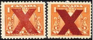 |
|
|
|
Post by jamesw on Dec 4, 2013 14:07:19 GMT
Niiiice. I believe the one on the right is an inverted X.
|
|
firstfrog2013
Member
Posts: 3,276
What I collect: BNA Liberia St Pierre U.S. Bolivia Turkey
|
Post by firstfrog2013 on Dec 4, 2013 14:35:31 GMT
James I'll check today may have better copy of that stamp if I do its yours.Been busy re-mounting modern stuff up to 2000 right now so closing in.My plan is to then try to get back to early stuff maybe even those small queens with a small break to clean up stamp room.I now have a large box almost completely filled with discarded supplement pages and pieces of showgard scattered everywhere.
|
|
therealwesty
Member
Inactive
Sorting my Small Queens
Posts: 331
|
Post by therealwesty on Dec 4, 2013 14:48:57 GMT
Nice exhibit jamesw! I have often been interested in exhibits but never taken the plunge to try and produce one. The last stamp club I was a part of was not really into exhibiting, our semi-annual shows were more of a bourse really. Was hard to get motivated to try my first when the rest of the crowd didn't seem interested.
|
|
firstfrog2013
Member
Posts: 3,276
What I collect: BNA Liberia St Pierre U.S. Bolivia Turkey
|
Post by firstfrog2013 on Dec 4, 2013 20:55:12 GMT
Sorry James was sure I had one but must have sent it on to another needy soul.
|
|
|
|
Post by jamesw on Dec 5, 2013 18:40:37 GMT
Thanks first frog. They probably needed it more than I do. I'm sure there's another in my future.
I've been revising the exhibit. I'll post later next week after the club meeting.
realwesty, I've just been getting into this myself. Kind of fun, and a great motivator to do some research.
|
|
|
|
Post by jamesw on Dec 13, 2013 4:11:01 GMT
Well, the club meet was tonight and my War Tax exhibit was one of nine. And guess what? Mine won first prize (well, to be honest it was a three way tie, but I won the 'shoot out'). Prize was a tin of chocolates, which my wife and daughters appreciated when I brought it home. So thanks to everyone for you input and advice. Obviously it pays to have connections to such a knowledgeable bunch. Here's the final product. Changed slightly, but essentially the same info. 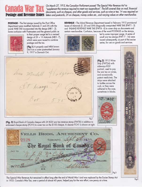 |
|
|
|
Post by stampgeezer on Dec 13, 2013 4:21:39 GMT
Congratulations!
|
|
rod222
Member
Posts: 9,875
What I collect: Worldwide Stamps, Ephemera and Catalogues
Member is Online
|
Post by rod222 on Dec 13, 2013 4:23:08 GMT
Very modest reply James, of course I didn't see the others, but your submission was very classy.
Loved the new Red Title heading, that was a top improvement.
Stamp magazines would welcome that sort of journalism. Albeit, adds pressure to get the information absolutely correct.
Congratulations, well deserved.
|
|
tomiseksj
Moderator  Woodbridge, Virginia, USA
Posts: 6,263
What I collect: Worldwide stamps/covers, Cinderellas, Ohio Prepaid Sales Tax Receipts, U.S. WWII Ration ephemera
|
Post by tomiseksj on Dec 13, 2013 14:33:25 GMT
|
|
Deleted
Deleted Member
Posts: 0
|
Post by Deleted on Apr 21, 2014 9:07:00 GMT
I feel inspired
|
|
I.L.S.
Departed
Rest in Peace
I am in Clearfield, Pa. I love US Classic covers!
Posts: 2,113
|
Post by I.L.S. on Apr 21, 2014 12:12:26 GMT
Very well done James! Bravo!!
|
|
|
|
Post by jamesw on Apr 22, 2014 3:21:26 GMT
Thanks (again) all. Hope to have this up to 12 pages by October. **Yikes! What have I done?  ** |
|


 **
**