Anping
Departed
Rest in Peace
Posts: 533  What I collect: Hong Kong, Aden & States & odd stuff I like.
|
Post by Anping on Apr 22, 2017 1:24:30 GMT
Many collectors use some form of colour key to help identify stamp colours and shades. One such accessory is the Stanley Gibbons Colour Key; a booklet of colour swatches hinged at one end that fans out: I bought one of these many years ago which is now somewhere in a drawer. To be honest, I found it to be as much use as teats on a boar. Perhaps it could be useful for more modern issues (or choosing wall paint colours); but for classic era stamps it is sadly lacking. In fact, for those thinking about buying one, they should consider this statement printed in the colour key's foreword: The problem is, this 'factoid' is not visible to the customer, as it is under the front cover all wrapped up in cellophane. Had I known all this, I wouldn't have bought the damn thing. To help illustrate the main problem with its use, here is an image that I copied from an eBay listing a few years ago: The seller had used the colour key to represent the colour of the stamp that he was listing. In this particular instance, that stamp is one from an issue that causes many collectors a lot of difficulty trying to identify. The difference in price of mint copies varies wildly between the shades; £55 to £250. So, although I thought the seller's intentions were admirable, the problem was it was completely wrong; which I think is rather obvious (well to me it is). But the point is, that comparing stamps that comprise coloured (engraved) lines interspersed with white space, with a solid block of colour on a colour key isn't going to work too well. Not all stamps have a convenient block of colour in them. The human eye tends to average the colours it sees when confronted with extremes e.g. red and white. This I suppose is very similar to a camera's light metering system, which averages the light entering the lens and adjusts the exposure setting accordingly. So we really need to compare like with like.This all leads me to the main purpose of this thread. WHAT HAPPENED TO THE ORIGINAL STANLEY GIBBONS COLOUR GUIDE? That fan type version that we can still obtain is not the first ever produced. Here is one which some collectors might be familiar with; the Stanley Gibbons' COLOUR GUIDE for Stamp Collectors: Now even this isn't the first version; which is apparent from the preamble inside the guide. This particular 'improved edition' however, was a joint venture between SG and printers Perkins, Bacon & Co., Ltd. Based on colours chosen by Stanley Gibbons, the printers created a series of perforated and gummed labels, using the same stamp production printing techniques mastered over many years. It was priced at 2 shillings and sixpence, which was quite a sum in those days (probably 1930's for this edition). The cost no doubt reflected the manual effort required to 'lick and stick' one hundred labels on the concertina style, four leaf (panel) cardboard guide. To reproduce a colour guide with stamp labels in this day and age would of course be prohibitively expensive. But; with modern printing methods I don't really see why a 21st Century version could not be done. The Guide labels: The labels themselves have both solid colours on the borders and typical engraved lines in the vignette. So the visual effect is very similar to that of viewing 'classic' stamps. The arrangement of the labels is perhaps a little odd: These progress through the colour spectrum (?) from left to right for the first row, across all four panels. Each label is individually numbered 1 to 20, and colour named. The next row then reverses direction from right to left; numbered 21 to 40. And so on for the next 3 rows. I was so impressed with this Colour Guide, that I tried to work out a way of representing it in a way that was viewable to a fairly good standard on a PC. The difficulty was handling the four continuous panels plus the unusual layout of the labels. So as a little project, I scanned in all sections of the guide; cleaned and tidied up the toning and wrinkling; split the labels into 'colour' types and reassembled them into a four page vertical format. A minor niggle is that some rows of labels are numbered in reverse; but I wasn't prepared to take apart individual rows of labels just to get everything in exact numerical sequence. Perhaps this may be of use to someone wanting a quick 'ball-park' identification. But obviously it is limited to 100 colour/shades and will not have some of the very bizarre colour representations that are sometimes found; such as pigeon blood red, or coquelicot, or amaranth red. So in the following posts are the results, starting with the guide's preamble and introduction, which I have had to enhance for readability : |
|
Anping
Departed
Rest in Peace
Posts: 533  What I collect: Hong Kong, Aden & States & odd stuff I like.
|
Post by Anping on Apr 22, 2017 1:27:34 GMT
|
|
Anping
Departed
Rest in Peace
Posts: 533  What I collect: Hong Kong, Aden & States & odd stuff I like.
|
Post by Anping on Apr 22, 2017 1:29:33 GMT
|
|
Anping
Departed
Rest in Peace
Posts: 533  What I collect: Hong Kong, Aden & States & odd stuff I like.
|
Post by Anping on Apr 22, 2017 1:30:46 GMT
|
|
Anping
Departed
Rest in Peace
Posts: 533  What I collect: Hong Kong, Aden & States & odd stuff I like.
|
Post by Anping on Apr 22, 2017 1:31:39 GMT
|
|
Anping
Departed
Rest in Peace
Posts: 533  What I collect: Hong Kong, Aden & States & odd stuff I like.
|
Post by Anping on Apr 22, 2017 1:33:26 GMT
|
|
Jerry B
Departed
Rest in Peace
Marietta, Georgia USA
Posts: 1,485 
|
Post by Jerry B on Apr 22, 2017 8:22:59 GMT
Hi anping Interesting analogy. However, I believe the expression, as I have always known it, was: 'teats on a bull'  I know someone who created his own color chart. It was similar to the SG one with labels. He would mount a known stamp on a page (one page, or more), per color. I know another that used Pantone samples. The Pantone "chips" are expensive but the person had access to them at work. I always wondered about variation in colors between various countries and printers. Between one or more countries, the same color could have variations. To me creating one's own color chart using stamps seems to make a lot of sense. Jerry B |
|
Anping
Departed
Rest in Peace
Posts: 533  What I collect: Hong Kong, Aden & States & odd stuff I like.
|
Post by Anping on Apr 22, 2017 11:02:41 GMT
I have a Pantone colour sample 'book', or at least one of them. There is a whole range for different applications; all extremely expensive and cumbersome. I can't see the real benefit of these, other than to accurately identify a colour by the Pantone identification codes. What then? As the code has no direct correlation with known catalogue colour descriptions, it merely provides an alternative colour code. However, I know one study that has used the Pantone system for an in depth study of Hong Kong KGVI definitives. The study was more scientific; attempting to differentiate between all the numerous printing releases and thus creating alternative printing groupings. This was a worthy study, but only for the small group of advanced collectors wanting such intense details. Unfortunately, this has little benefit to the general collector, particularly if they refer to standard catalogues for album write-ups or buying and selling; they need to use a standard colour system. When writing about this very subject a while ago, a member recommended a particular online colour recognition program, which I enthusiastically tried. The results of the analysis on my 'samples' was just a breakdown of the constituent parts of the ink used; x% red, y% indigo, z% black etc. Now this may be useful for comparing stamps together, e.g: Have I got two different shades on my two stamps? But it relied on absolutely precise cursor targeting on BOTH stamps. Once again, it could not tell me that I had a 'carmine-rose', rather than a 'salmon pink'. I know of others who do this, and this is probably the best overall approach, BUT; this assumes you have got the right identification in the first place AND you have copies of the scarce/rare shades in your collection. This isn't always possible if, for example you collect the Australian GV definitives, where some of the seemingly endless shades differ minutely and prices of certain varieties can be huge. I don't think this subject will never be properly resolved. We can only "endeavour to persevere". |
|
Jerry B
Departed
Rest in Peace
Marietta, Georgia USA
Posts: 1,485 
|
Post by Jerry B on Apr 22, 2017 12:03:17 GMT
Hi Anping
I would never judge a color on a monitor. That is probably the most inaccurate of all the methods.
I know two specialized Colombian catalogs and their authors. One comes from Spain and the other is Colombian. The colors in the catalogues for the same stamp are different. Even though they both speak proper Spanish the color names are interpreted differently. I am sure this is the situation with all catalogs and color.
I agree that the color issue will never be truly resolved.
Jerry B
|
|
Anping
Departed
Rest in Peace
Posts: 533  What I collect: Hong Kong, Aden & States & odd stuff I like.
|
Post by Anping on Apr 22, 2017 12:24:29 GMT
I would never judge a color on a monitor. That is probably the most inaccurate of all the methods. Not ideal I know, particularly if buying online based on images that are subject to the inaccuracies of scanner settings and our own monitor settings. But if you have no other reference other than a colour key swatch, it may at least eliminate wayward identification. There is of course the argument that one shouldn't buy high end material just from online images; which I wouldn't disagree with. |
|
Ryan
Moderator  Calgary, Alberta, Canada
Posts: 2,753  What I collect: If I have a catalogue for it, I collect it. And I have many catalogues ....
|
Post by Ryan on Apr 23, 2017 2:20:18 GMT
There are some nitpick aspects of stamp collecting that I enjoy quite a bit - plate varieties, perforation varieties, watermark varieties, etc. But colour shades have never given me much joy, mostly because I find it so hard to tell one from another. If I had $100K I'd buy one of those nifty video spectral comparators and I'd let a machine come up with a quantified difference. Here's an article which says "stand back, I'm going to do some science!" A VSC and X-ray fluorescence are used to pick apart some shade differences on classic US stamps. The U.S. 1851 3¢ Stamp: Color, Chemistry, and Changes[Broken image link removed] Ryan edit - I can't guess what broken image link was here, as I've been using the same image host (Google Photos) since this forum began and haven't lost any other images (as far as I know, anyway). Maybe it was this snip from the article referenced, showing the spectrograph resulting from the X-ray fluorescence machine's analysis of stamp ink, in which the relative concentrations of various elements can be measured.  Or maybe it was this lolcat meme. Hooray for lolcat memes!  |
|
Deleted
Deleted Member
Posts: 0
|
Post by Deleted on Apr 23, 2017 16:24:43 GMT
A 1917 German color guide book I have in German/French/English. Interesting given the color printing technology available 100 years ago but time has certainly had some effect.  |
|
jrodriguex
**Member**  Inactive
Posts: 26  What I collect: US Classics, Costa Rica Bernardo Soto Series 1889
|
Post by jrodriguex on May 5, 2017 14:09:35 GMT
Thanks Anping for an interesting post. I haven't been around long enough to know a better SG color guide existed. I have the current SG color guide and I agree it's quite hard to use. It gets even more complicated when trying to use different catalogues!! I have been struggling to find a better tool for this |
|
Londonbus1
Moderator  Cinderella Stamp Club Member 3059
Posts: 5,067  What I collect: Wonderland; 1912 Jubilee International Stamp Exhibition, London ('Ideal' Stamp, ephemera); French Cinderellas with an emphasis on Poster Stamps; Israel and Palestine Cinderellas ; Jewish National Fund Stamps, Labels and Tags; London 2010, A Festival of Stamps (anything); South Africa 1937 Coronation issue of KGVI, singles or bi-lingual pairs.
|
Post by Londonbus1 on May 5, 2017 14:29:31 GMT
The Colour Guide labels can still be found with full gum, most often in lots of similar colours. Always interesting to see that. Pricey though most times. Here is another SG Colour Guide from the late 1960's. I call it the 'Paint Job' !! 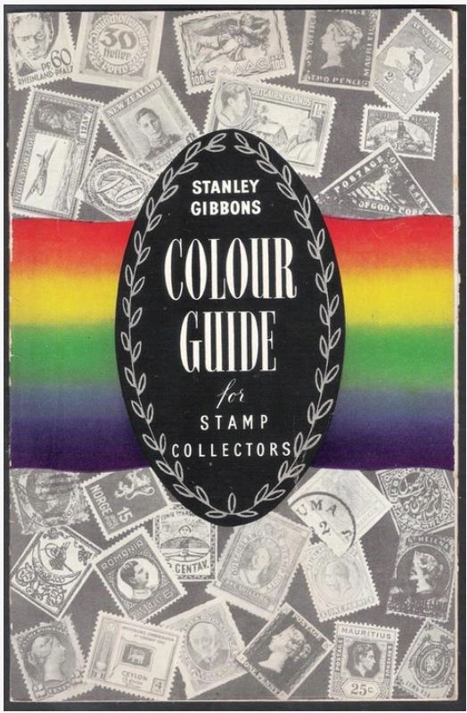  |
|
Anping
Departed
Rest in Peace
Posts: 533  What I collect: Hong Kong, Aden & States & odd stuff I like.
|
Post by Anping on May 5, 2017 14:34:25 GMT
The Colour Guide labels can still be found with full gum, most often in lots of similar colours. Always interesting to see that. Pricey though most times.
A local dealer who supplies me with GB Prestige booklets, listed one a couple of years ago on eBay. It sold for an amazing £56. |
|
|
|
Post by daniel on Oct 3, 2020 3:33:52 GMT
Here's a different approach to colour guiding from 1949, it is unclear exactly who has produced it but it was published by The Smith Press of New Malden in the UK. Not Stanley Gibbons but this seems to be the best place for it.  Colour Chart 1 Colour Chart 1 by Daniel, on Flickr 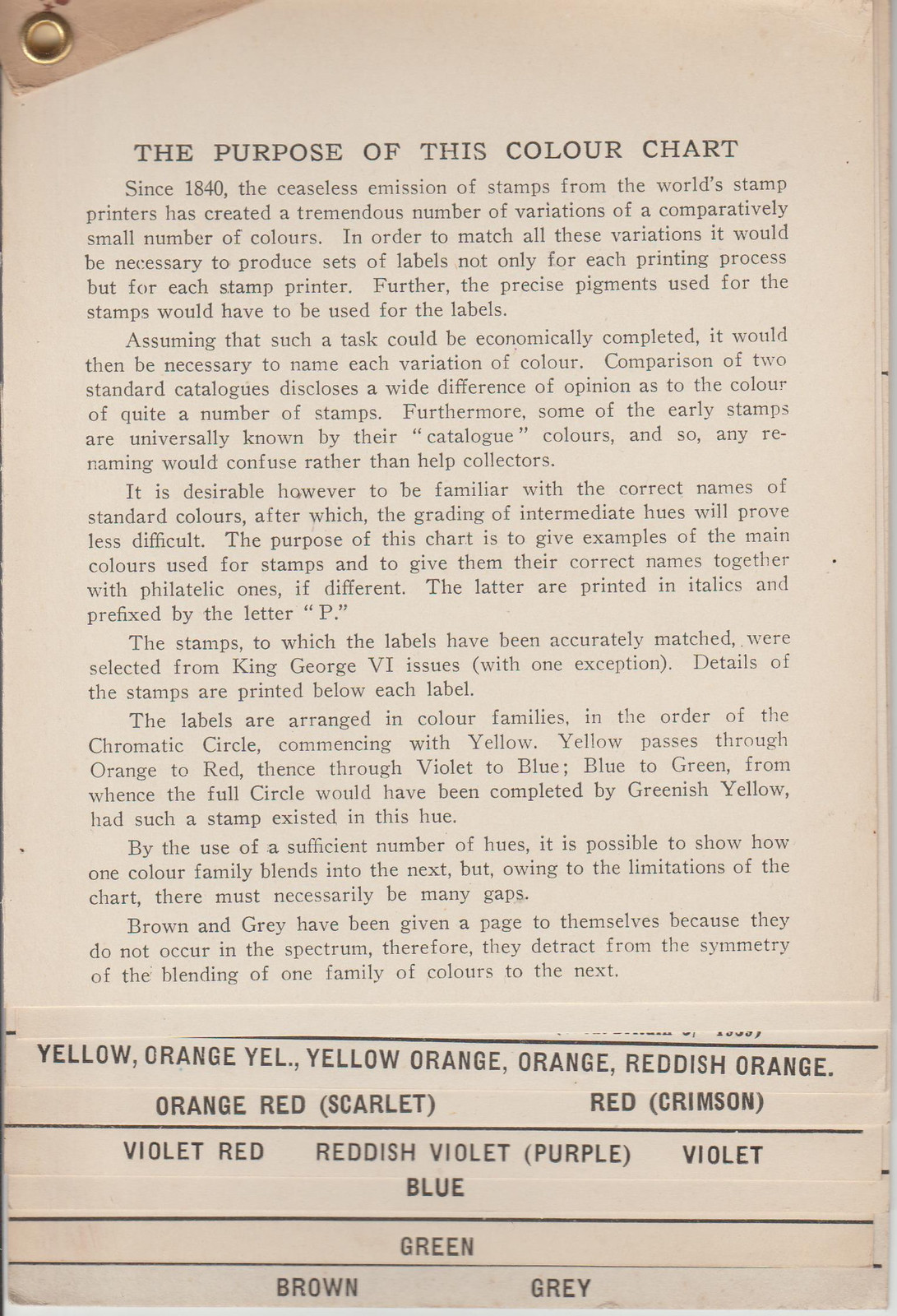 Colour Chart 2 Colour Chart 2 by Daniel, on Flickr  Colour Chart 3 Colour Chart 3 by Daniel, on Flickr |
|
|
|
Post by daniel on Oct 3, 2020 3:36:51 GMT
|
|
|
|
Post by daniel on Oct 3, 2020 3:38:50 GMT
|
|
|
|
Post by daniel on Oct 3, 2020 3:42:11 GMT
|
|
nikhil
Member  Working on Australia, GDR, Japan
Posts: 552
What I collect: I collect WW. Looking for early issues.
|
Post by nikhil on Oct 3, 2020 4:06:07 GMT
Nice one daniel ! I believe the Stanley Gibbons Colour Key has been discontinued which is unfortunate 😞 |
|
ajkitt
Member  Inactive
Posts: 175
What I collect: Classics, Central Europe, World
|
Post by ajkitt on Oct 3, 2020 4:39:58 GMT
Nice one daniel ! I believe the Stanley Gibbons Colour Key has been discontinued which is unfortunate 😞 I'm glad I bought one (the fan type foldout one shown in the top post) when I did, then (assuming that's the one that got discontinued). Found it on ebay last week and it was delivered this morning! I also found a copy of the book and it's on its way (found that on an auction house listing), I think the one I have coming is dated 1938 maybe? And, I already have the Michel pamphlet version, and the (completely useless) Wonder Card thing... Seriously... I *AM* going to write an article on color some day!  It is soooo not what people think... Daniel, if you ever need a home for that Smith Press thing, I might know an interested buyer!  |
|
Beryllium Guy
Moderator 
Posts: 5,914  What I collect: Worldwide Stamps 1840-1930
|
Post by Beryllium Guy on Oct 3, 2020 7:20:34 GMT
Here's a different approach to colour guiding from 1949, it is unclear exactly who has produced it but it was published by The Smith Press of New Malden in the UK. Not Stanley Gibbons but this seems to be the best place for it.Daniel, many thanks for posting this new colour identification resource and putting it in this thread, which was originally started to show two types of Stanley Gibbons' colour ID guides. I completely agree with your choice of adding it to this thread, so I have changed the thread name to make it more inclusive. Anytime you see a similar situation where you want to post something that should fit into an existing thread but only the thread name is putting you off, please go ahead and make your post, just as you did, and feel free to tag me or anyone on the Moderator Team to request a change to the thread name. Thanks again for taking the time to find a suitable existing thread for your post rather than just automatically starting a new one.    |
|
Mr. H
Member  Member - APS #129381
Posts: 952
What I collect: US, Netherlands, Whatever suits my fancy.
|
Post by Mr. H on Oct 3, 2020 15:54:08 GMT
|
|
renden
Member 
Posts: 9,165  What I collect: Canada-USA-France-Lithuania-Austria--Germany-Mauritius-French Colonies in Africa
|
Post by renden on Oct 3, 2020 16:13:03 GMT
Mr. H I agree that a US color chart with a price of $US 500 + shipping is way up there  nikhil nikhil - I was lucky (or unlucky) enough to buy the SG Stamp color key. When I get a better chart I will mail it to Bombay  daniel daniel - looks good and another reference I would think that every Country has its color chart - I use 3 examples: 1) SG color key for British stamps 2)Canadian color charts (Large and Small Queens, separate books) for those + lots of articles 3) Bernard Binette's "Le grand nuancier des timbres classiques de FRANCE Cérès et Napoléon 1849-1876 for the french classics. I have these 3 and the names of colors differ from reference to reference. FRANCE has certainly pushed the limit in Color classification (my friend Stan "sttainlessb) know all about their complexity. A great subject - Wouldn`t it be a nice project to gather all WW color charts !! ?? René
|
|
stainlessb
Member  qaStaHvIS yIn 'ej chep
Posts: 4,914
What I collect: currently focused on most of western Europe, much of which is spent on France, Belgium, Germany and Great Britain Queen Victoria
|
Post by stainlessb on Oct 3, 2020 18:02:20 GMT
i can't say I'm overly impressed with the SG color "fan"
It seems to work best on UK stamps...and even that's a bit of a stretch
a reference, but not IMHO a great one
|
|
Londonbus1
Moderator  Cinderella Stamp Club Member 3059
Posts: 5,067  What I collect: Wonderland; 1912 Jubilee International Stamp Exhibition, London ('Ideal' Stamp, ephemera); French Cinderellas with an emphasis on Poster Stamps; Israel and Palestine Cinderellas ; Jewish National Fund Stamps, Labels and Tags; London 2010, A Festival of Stamps (anything); South Africa 1937 Coronation issue of KGVI, singles or bi-lingual pairs.
|
Post by Londonbus1 on Oct 3, 2020 19:54:00 GMT
Here's a stamp 'fan' of Specimen inks used by Harrison & sons. Not exactly a colour guide (unless there are others) but quite fitting nonetheless. The design of the labels has been seen on Exhibition material and other ephemera. the labels can also be found unused. 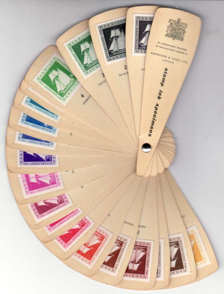 |
|
gmot
Member 
Posts: 205
What I collect: Canada & French Morocco
|
Post by gmot on Oct 3, 2020 23:14:09 GMT
I recently obtained the Michel Colour Guide - partly to assist with some early Italian shades - and have found it fairly useful so far, both for those and some early British colony issues. It does take a bit to understand their system (helpfully explained in an English intro). We'll see how much long-term usefulness it has, but so far so good.
|
|
khj
Member 
Posts: 1,524 
|
Post by khj on Oct 3, 2020 23:51:47 GMT
If anyone does try to get one of these, please be aware of the following: -- the value is in the color plates, as the set is dirt cheap without the color plates; also make sure all the color plates are present; think of it as buying a $500 stamp with all teeth present or missing 5-7 teeth or all teeth trimmed off (the price difference is significant) -- if you can't tell the difference between minute differences in shade, then the pages won't be of much use to you (you've purchased an investment, not a reference; my opinion) I look at the color plate showing "pigeon blood pink", and all I can say is half the stamps pictured on that color plate of shades of pink look like the same shade to me. I don't know if I'm really that bad with color shades, or pretty typical of most collectors. Probably the former. |
|
khj
Member 
Posts: 1,524 
|
Post by khj on Oct 3, 2020 23:58:04 GMT
Just a reminder, any philatelic color guide is based on the color definitions for that specific catalog publishers. Some color definitions, especially shades, are not the same among the publishers. Indeed, I've even seen examples between Scott & SG where the 2 color names are actually reversed for 2 completely different stamps. So use SG catalog for SG color key, Scott for Scott, Michel for Michel, Scott for White...
I admit, I use SG color guide even though I mainly use the Scott catalog to ID my stamps. However, I have to keep in mind there are certain color definitions between Scott & SG that are notably different.
|
|
renden
Member 
Posts: 9,165  What I collect: Canada-USA-France-Lithuania-Austria--Germany-Mauritius-French Colonies in Africa
|
Post by renden on Oct 4, 2020 1:17:14 GMT
khjnot sure that works and what color chart does Scott publish  ? They do not seem very concerned with color - I inventoried a bunch of early FRANCE using the 2 Cats (Scott and Maury) and they are in 2 different worlds - the "french" know how to described their colors !!!! Thanks - René
|
|


 It is soooo not what people think...


 ? They do not seem very concerned with color - I inventoried a bunch of early FRANCE using the 2 Cats (Scott and Maury) and they are in 2 different worlds - the "french" know how to described their colors !!!!