Andy Pastuszak
Member  Praying for my family and everyone in Ukraine.
Posts: 1,533  What I collect: United States, Ukraine, Ireland
|
Post by Andy Pastuszak on Dec 23, 2021 4:03:34 GMT
Let me start off my saying I'm a HUGE font nerd. I obsess over fonts in my personal documents far more than the average person.
I'm also a huge fan of the Helvetica typeface. The Helvetica font has been one of the staple fonts in use around the world since the 1960s. It took the world by storm and is everywhere now. Personally, I really like it. Starting with the mid 90s there have been attempts to tweak it and make it better. The first updated to Helvetica was Helvetica Neue, which was an attempt to just clean up a lot of the idiosynchrocies in the font that were there when it was converted from letterpress machines to digital typography. Another attempt to clean up Helvetica led to Helvetica Now, who's goal was to make the font more legible on modern hi-res screens. Helvetica Now also included a "micro" version of the font, which was supposed to be easier to read at very small point sizes. Another foundry released Neue Haas Grotesk, which was an attempt to make Helvetica look more like what it looked like on letterpresses, prior to the advent of digital typography. Neue Haas Grotesk was the original name of Helvetic when it first came out. Then we have Neue Haas Utica, which was not really an attempt to clean up Helvetica, but more an attempt to make a modern font inspired by Helvetica. Andy lastly, we have Arial, which is font that kinda looks like Helvetica at times, but isn't really Helvetica. I always found the font to be quite boring. Then I read an interview with the guy that developed it, and he said the instructions he was given was to make a sans-serif font that is as boring as possible. Now that the story behind this is out of the way, I was hoping I could ask a favor here. I am curious which font of all these Helvetica and Helvetica-like fonts do you like the best. Here is what I have. I am going to post some 300 dpi scans I did of 2 test pages I did with all these fonts printed out. I'm also going to post a link to a 2 page PDF you can print out on your printer at home to look at on paper. I would love people's feedback on which they like the best. The difference between fonts is subtle. You're not going to look at this and immediately go "Oh wow! That one is way better than the others." So, we start here. These are the scans that I printed on my Brother HL-3170CDW laser printer:   These are the scans of the pages printed on Epson ET-2750 inkjet printer:   And lastly, here is a link to the PDF you can print yourself. 1drv.ms/b/s!AtiQqOMmDyztgbcz8a85Wb9KykCEeg?e=UwAtiE And, "I can't tell a difference" or "I can tell a difference but they all look fine to me" is acceptable. |
|
ameis33
Member
What's in a name? That which we call a rose, by any other name would smell as sweet
Posts: 505
What I collect: Poland and Italy Republic
|
Post by ameis33 on Dec 23, 2021 9:02:40 GMT
A font? What's in a font? That which we write as rose, by any font we'd use would smell as sweet
|
|
angore
Member
Posts: 5,335
What I collect: WW, focus on British Empire
|
Post by angore on Dec 23, 2021 11:35:12 GMT
I found Arial a bit too bold at times compared to Helvetica so I am a Helvetica fan.
My comments - Grotesk is slightly bolder. I do not like the small text with Micro.
My preference is Helvetica Standard as the smaller text looks better (kerning spacing consistent with larger sizes) compared to Unica.
|
|
REL1948
Member
Posts: 583
What I collect: 1840-Pre-Decimal, GB and Colonies, 1840 1 penny reds, Postal Histories
|
Post by REL1948 on Dec 23, 2021 11:38:02 GMT
Arial font, always and forever. I guess that makes me boring.....
Rob
|
|
angore
Member
Posts: 5,335
What I collect: WW, focus on British Empire
|
Post by angore on Dec 23, 2021 11:54:35 GMT
Here is a simple comparison  |
|
brightonpete
Departed
Rest in Peace
On a hike at Goodrich-Loomis
Posts: 5,110
|
Post by brightonpete on Dec 23, 2021 12:24:07 GMT
I never did like Arial, and deleted it from my computer. I usually use Helvetica Neue, although I'd have to say I do like a serif font. The Helvetica Now Micro looks like it was a couple points larger than the others. It's very large in comparison, perhaps that's why it "seems" to be easier to read.
Mono-spaced, I like "Jet Brains Mono." But then this is all about Helvetica, those others are for another thread!
Peter
|
|
stainlessb
Member
qaStaHvIS yIn 'ej chep
Posts: 4,638
What I collect: currently focused on most of western Europe, much of which is spent on France, Belgium, Germany and Great Britain Queen Victoria
|
Post by stainlessb on Dec 23, 2021 14:27:04 GMT
calibri....
|
|
Andy Pastuszak
Member
Praying for my family and everyone in Ukraine.
Posts: 1,533
What I collect: United States, Ukraine, Ireland
|
Post by Andy Pastuszak on Dec 23, 2021 14:30:03 GMT
I think the same thing about the Helvetica Now Micro. It's way bigger at a given point size that Helvetica Now Text. Not a fan.
As much as I am not a fan of Arial, I won't remove it, because it's a font almost everyone has. That makes it easy to use when working with word processing documents,emails, and other things you need to share with other people. If you're passing around PDFs, you can embed the font, so it's a non-issue. You can't do that with other types of documents.
|
|
Beryllium Guy
Moderator 
Posts: 5,653
What I collect: Worldwide Stamps 1840-1930
|
Post by Beryllium Guy on Dec 23, 2021 16:23:21 GMT
Good call, Stan! I also like Calibri, more than Arial, at least. Where I currently work, Arial is the default font for all of our report documents and emails, so I have gotten used to it. But at my previous place, Calibri was the default for emails, and I found that I liked that better. I can't honestly say why I like it better, but I just like the look of it. Andy ( Andy Pastuszak), for what it's worth, I don't see a big enough difference in the various fonts you are considering to enable a clear choice. These are true subtelties that are lost upon me. In that case, I would say that if you can see those slight differences, then just go with the one that looks the best to you. I also want to thank you, Andy, for pointing all of this out. This has been my lesson for today!  |
|
Andy Pastuszak
Member
Praying for my family and everyone in Ukraine.
Posts: 1,533
What I collect: United States, Ukraine, Ireland
|
Post by Andy Pastuszak on Dec 23, 2021 16:39:03 GMT
To my eyes, when I print this out on paper, I think Neue Haas Grotesk looks the best. When I lay it side by side with Helvetica, it looks just a little crisper and cleaner.
|
|
|
|
Post by mdroth on Dec 23, 2021 16:43:46 GMT
I do love your posts - you come up w/some great lines - and this one made me laugh! (So thanks for that!) (Instant reaction - is there a separate forum for 'font nerds' to discuss fonts?!?) For ease of reading - assuming your 'reader' or 'audience' is top priority - Times New Roman is the standard. Numerous studies have been done on this. If we're talking 'art' or style/pleasing - for ourselves - as I would assume for your own album pages: Let's start at the bottom: I hate Arial. Crude. Calibri not much better. Helvetica is a small step better, but in my mind, still a crude font. Can't see enough of a difference in your various Helvetica fonts to choose - the differences are subtle and you would have to consult a fellow font-nerd! (I assume you know where they hang out?!)  When I want style/beauty: I like Comic Sans. A bit 'casual' and perhaps a tiny bit goofy, but I like the look. In terms of elegance, I like Garamond. It seems 'prettier' than almost any other font I've seen/used. If I did my own album pages, Garamond would likely be my choice... Your albums - your choice! (Assuming approved by the International Federation of Font Nerds!!) |
|
Andy Pastuszak
Member
Praying for my family and everyone in Ukraine.
Posts: 1,533
What I collect: United States, Ukraine, Ireland
|
Post by Andy Pastuszak on Dec 23, 2021 17:30:50 GMT
Honestly, I don't know where other font nerds hang out. But I'm sure one day I'll meet the other one.
So, here is a quick story of what led me to the path of font nerdhood.
In 1986 I graduated high school. In September 1986 I went to Drexel University. Drexel University required we all buy Macintosh computers. We got a copy of MacWrite (Word Processor) to do our school work. When I was writing a paper back then, it had to be a certain number of pages long. I learned very quickly that different fonts would make subtle changes to the length of the document. So I started trying to find fonts on the crude text-based Internet. I found a font called Boston II. Boston II was designed to make your output look like a typewriter. I thought it was kind of cool, so I installed it. Well, Boston II added a half page to my report without me needing to do anything!
Then I printed my report out on my Epson AP-80 dot matrix printer. And I was shocked at how nice and clean the letters looked. Back then, there was no TrueType fonts with variable point sizes. When you got a font, you had to install different sizes. And I learned that the Apple operating system would take a font twice the size you used and shrink it down when it printed. So if you were printing in 12 point, to get a nice crisp printout, you needed to have the 24 point font installed. Otherwise it would just use the 12 point bitmap and look all blocky.
I tried to explain this point size thing to my fellow classmates and they honestly did not care.
At that point I began to experiment with different fonts to see how they would affect the size of the text. See which fonts I could get away with that didn't look very big, but added space to the document, so I would have to work less. And I noticed that my professors seemed to have an appreciation for a handed in assignment with crisp clean fonts.
As I kept playing with different fonts, I just naturally started to like the look of some fonts better than others. Times was OK. But Garamond was way better.
Then PageMaker came out. And I thought it was the coolest thing ever. I was designing flyers for clubs I belonged to. I remember designing flyers in 10 different fonts and asking the club to pick which one they liked best.
And its kind of stuck with me over the years.
|
|
REL1948
Member
Posts: 583
What I collect: 1840-Pre-Decimal, GB and Colonies, 1840 1 penny reds, Postal Histories
|
Post by REL1948 on Dec 23, 2021 18:46:40 GMT
OK Andy, I see where you're coming from with your history. Here's mine.
I was a Publications Editor at Volkswagen of America for almost 20 years (1982-2000). I was responsible for editing all of the Powertrain material supplied by the parent company in Germany for the American market. When I first started, we were creating photographable art-boards using IBM Selectric typewriters, razor knives, steel rules and rubber cement to create Repair Manuals for the various models. Our department had been using Times Roman fonts in our IBM Selectrics for awhile but one day we were told to immediately stop using them and convert all of our work to a sans serif font. The only one available was Monotype at the time so we began using it.
The reason we were given is that VW Repair Manuals were published in over 20 languages and some of the Markets used the US Manuals as a model and merely translated them. That's where serif based fonts became an Issue with the Factory because they felt that serif fonts could blend or bleed into translation misunderstandings if say accents like a tilde (~ Spanish) or an umlaut (ü German) for example was misconstrued. Better yet were the Arabic translations where the interpreters often scrutinized our English and added information that wasn't there.
I have to say I never really understood their reasoning nor embraced it but I went along. It wasn't long before we got our first word processors and Germany made sure that the native fonts installed were sans serif. In the process the font formerly called Monotype became Arial. It became the corporate standard and that was that. I got so used to it that I made it my own for any writing I've ever done since those days.
Do I love the Arial font? No, I don't really care very much one way or another, I'm just used to it. I will say that Garamond is an elegant appearing font. My initials are REL, if you were to say Arial out loud (as often was bandied about the office) it would catch my attention. Some of my colleagues used to address me by my initials, so you see even my name is married to the font in a strange way.
"Arial, sometimes marketed or displayed in software as Arial MT, is a sans-serif typeface and set of computer fonts in the neo-grotesque style. Fonts from the Arial family are packaged with all versions of Microsoft Windows from Windows 3.1 onwards, some other Microsoft software applications, Apple's macOS] and many PostScript 3 computer printers. The typeface was designed in 1982, by Robin Nicholas and Patricia Saunders, for Monotype Typography. It was created to be metrically identical to the popular typeface Helvetica, with all character widths identical, so that a document designed in Helvetica could be displayed and printed correctly without having to pay for a Helvetica license.
The Arial typeface comprises many styles: Regular, Italic, Medium, Medium Italic, Bold, Bold Italic, Black, Black Italic, Extra Bold, Extra Bold Italic, Light, Light Italic, Narrow, Narrow Italic, Narrow Bold, Narrow Bold Italic, Condensed, Light Condensed, Bold Condensed, and Extra Bold Condensed. The extended Arial type family includes more styles: Rounded (Light, Regular, Bold, Extra Bold); Monospaced (Regular, Oblique, Bold, Bold Oblique). Many of these have been issued in multiple font configurations with different degrees of language support. The most widely used and bundled Arial fonts are Arial Regular, Italic, Bold, and Bold Italic; the same styles of Arial Narrow; and Arial Black. More recently, Arial Rounded has also been widely bundled.
In Office 2007, Arial was replaced by Calibri as the default typeface in PowerPoint, Excel, and Outlook."
From Wikipedia, the free encyclopedia
Probably more information about the Arial typeface than any of you want to know.....
Rob
PS This Post was written with Arial (12 point)
|
|
Andy Pastuszak
Member
Praying for my family and everyone in Ukraine.
Posts: 1,533
What I collect: United States, Ukraine, Ireland
|
Post by Andy Pastuszak on Dec 23, 2021 19:23:43 GMT
I had no idea you could change fonts on here. Kinda cool.
|
|
angore
Member
Posts: 5,335
What I collect: WW, focus on British Empire
|
Post by angore on Dec 23, 2021 21:33:06 GMT
I know Arial MT was the included font in early Adobe Acrobat. If you did not have Helvetica it would use Arial MT. Early Steiner pages used Arial MT when he created them using PageMaker. In the early days. Steiner provided the source PageMaker files. IBM, rather than license Helvetica, used their own version of Arial called Sonoran Sans Serif as their basic san serif font for large printers (IBM 3800 series). The serif version was called Sonoran Serif and based upon Times Roman.
|
|
Andy Pastuszak
Member
Praying for my family and everyone in Ukraine.
Posts: 1,533
What I collect: United States, Ukraine, Ireland
|
Post by Andy Pastuszak on Dec 23, 2021 22:06:20 GMT
I know Adobe designed a font called Myriad, which was supposed to able to stretch in any direction, and could be used to substitute for another font without changing the spacing of the text. The idea never really caught on, but I remember early versions of Adobe Acrobat Reader having Myriad built in for font substitution.
|
|
eggdog
Member
I want a new Harley!
Posts: 464
What I collect: It's complicated....
|
Post by eggdog on Dec 23, 2021 23:05:45 GMT
Nerd Alert! I get geeked over this stuff, too. I wanted to jump in and spout some opinions without taking the time to download the .pdf's because of course I did.
I would say that I didn't care much for Helvetica Now. And I assume that the Micro was what kind of puffed up the text part ("pro-Russian hetman of Left-Bank Ukraine", etc.) and it doesn't work for me at all. (BTW, isn't the Left Bank in Paris?)
The Neue Hass fonts looked the best overall. The Grotesk is bold without being blobby, but the Unica might be more supple overall. If I was in the market for a revived Helvetica, I'd check them out and also Neue. If I need to use a sans-serif for contrast (e.g. a caption), I usually go with something more defiantly sans, like Franklin Gothic.
My first Helvetica knockoff was Swiss 721 by Bitstream. In retrospect, it looks incredibly cramped and I don't use it at all any more (though I kept installing it on new computers for like 25 years because I get sentimental over old typefaces, proving that I have a heart, if maybe not a life). So does Arial, to a lesser extent. I think, though, that they looked less cramped on low-resolution monitors and what Windows 3.1 and Windows 98 (never mind DOS 3.3) were capable of rendering. Goudy Old Style, which is beautiful, was unreadable on many screens - its lines were too subtle.
I use Arial for domestic documents (to-do lists and such) because my wife finds it readable. For most things that leave the house, I use Carmina and an old favorite, Bitstream Amerigo, and a couple of designer one I got on MyFonts. Or a few more Bitstreams. That company is owned by Monotype now, but Monotype hasn't expanded the Unicode sets on any of them as far as I can tell. A Russian company has added Cyrillic to a couple of them; I haven't had a chance to check them out yet.
I'll have more to say (oh noooo!) when I look at the .pdf's.
|
|
Andy Pastuszak
Member
Praying for my family and everyone in Ukraine.
Posts: 1,533
What I collect: United States, Ukraine, Ireland
|
Post by Andy Pastuszak on Dec 24, 2021 0:00:36 GMT
Nerd Alert! I get geeked over this stuff, too. I wanted to jump in and spout some opinions without taking the time to download the .pdf's because of course I did. I would say that I didn't care much for Helvetica Now. And I assume that the Micro was what kind of puffed up the text part ("pro-Russian hetman of Left-Bank Ukraine", etc.) and it doesn't work for me at all. (BTW, isn't the Left Bank in Paris?) The Neue Hass fonts looked the best overall. The Grotesk is bold without being blobby, but the Unica might be more supple overall. If I was in the market for a revived Helvetica, I'd check them out and also Neue. If I need to use a sans-serif for contrast (e.g. a caption), I usually go with something more defiantly sans, like Franklin Gothic. My first Helvetica knockoff was Swiss 721 by Bitstream. In retrospect, it looks incredibly cramped and I don't use it at all any more (though I kept installing it on new computers for like 25 years because I get sentimental over old typefaces, proving that I have a heart, if maybe not a life). So does Arial, to a lesser extent. I think, though, that they looked less cramped on low-resolution monitors and what Windows 3.1 and Windows 98 (never mind DOS 3.3) were capable of rendering. Goudy Old Style, which is beautiful, was unreadable on many screens - its lines were too subtle. I use Arial for domestic documents (to-do lists and such) because my wife finds it readable. For most things that leave the house, I use Carmina and an old favorite, Bitstream Amerigo, and a couple of designer one I got on MyFonts. Or a few more Bitstreams. That company is owned by Monotype now, but Monotype hasn't expanded the Unicode sets on any of them as far as I can tell. A Russian company has added Cyrillic to a couple of them; I haven't had a chance to check them out yet. I'll have more to say (oh noooo!) when I look at the .pdf's.
A little bit of Ukrainian history. During the Cossack era in Ukrainian history, Ukraine was part of the Russian Empire. The Russian Military in certain parts of the empire were made up of Cossack Hosts, each of which had a section of the empire assigned to it. The Cossacks in Ukraine actually established a local government. I'm not sure if Russian Cossack hosts also established local governments. Ukraine was split into two Cossack Host territories, Left Bank Ukraine, and Right Bank Ukraine. These were the banks of the Dnipro River, which runs through the center of Ukraine. Cossacks were fiercely Orthodox, so they little love for The Kingdom of Poland.
|
|
|
|
Post by clivel on Dec 24, 2021 5:09:18 GMT
I don't think that one can really compare the paragraphs of text unless they are the exact same physical height - irrespective of the point size specified.
Also, I think that it would be easier to compare if only the text paragraphs, without images were present on the page.
Clive
|
|
angore
Member
Posts: 5,335
What I collect: WW, focus on British Empire
|
Post by angore on Dec 24, 2021 10:42:53 GMT
When I was trying to pick a new serif font for some pages I used Lorem ipsum text to print paragraphs to compare styles. There are a lot of different Garamonds and the one I have is not very good.. It showed how many fonts had the same basic metrics so you could change and not affect layout.  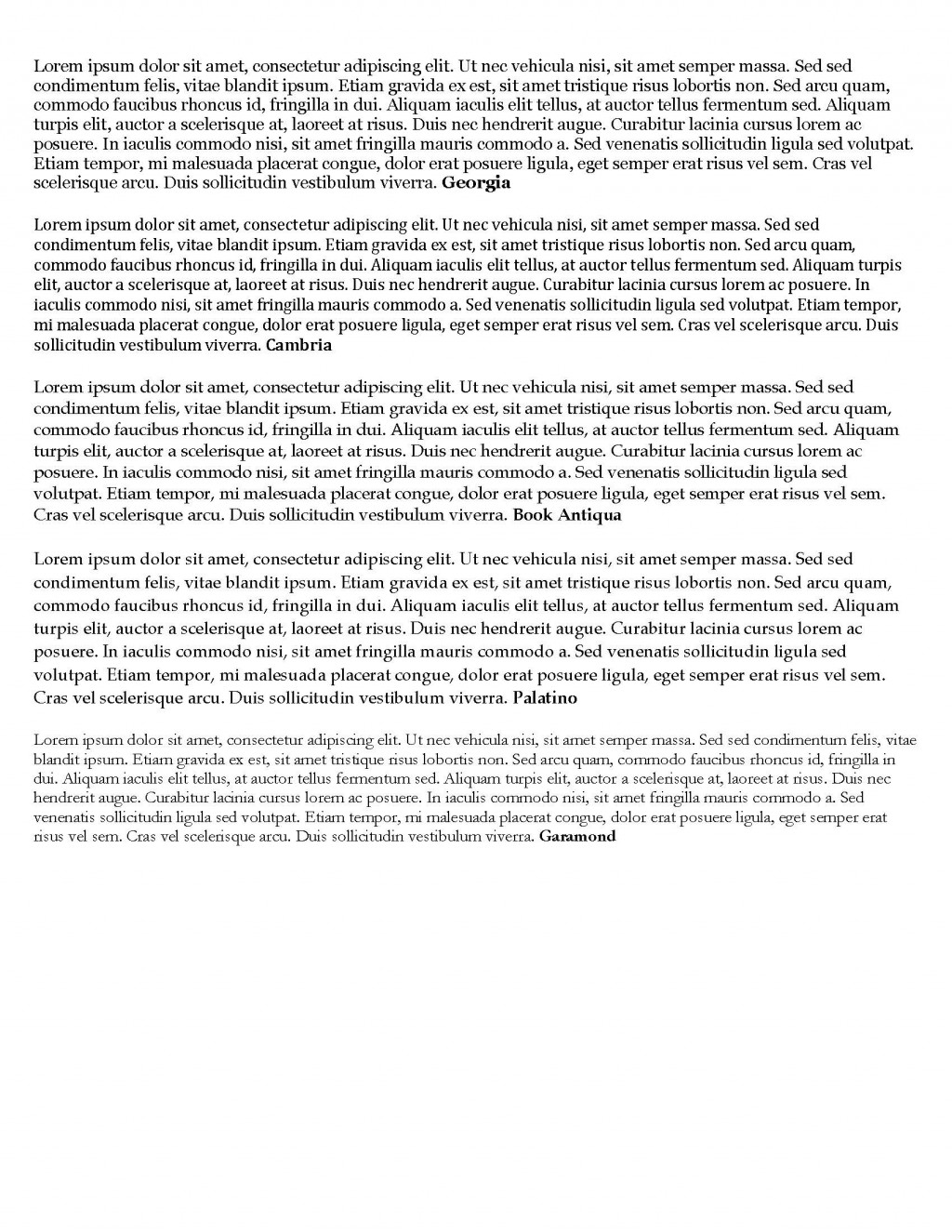 |
|
Jerry B
Departed
Rest in Peace
Marietta, Georgia USA
Posts: 1,485
|
Post by Jerry B on Dec 24, 2021 12:24:12 GMT
Hi
I normally use Arial. However, on some of my programs I have used Verdana, especially in menus, labels, etc..
When I send a document to someone I use RTF as just about every computer can handle it. I feel the same way about Arial. May not like it but everybody can handle it.
Jerry B
|
|
DrewM
**Member** 
Posts: 26
|
Post by DrewM on Mar 27, 2022 21:29:45 GMT
These are the fonts available on this website:
I had no idea fonts were so interesting. (Georgia. Elegant and readable. I like this a lot.)
I had no idea fonts were so interesting. (Arial. It's everywhere. I use this on my homemade album pages for subheadings since it's so readable even in small sizes.)
I had no idea fonts were so interesting. (Comic Sans. It's cartooney and chidlish. And overused. It's used far too often in the wrong place such as for serious titles which is embarrassing) .
I had no idea fonts were so interesting. (Courier New. Looks like typewriting and who can dislike that? But it's too stretched out for my taste.)
I had no idea fonts were so interesting. (Impact. This is really a ridiculous font that's almost unreadable. Can you even read this?)
I had no idea fonts were so interesting. (Times New Roman. Like Courier but much more under control. I love this font. As a teacher, I required all my students to use this font in their research papers in order to standardize the length of the papers).
I had no idea fonts were so interesting. (Trebuchet MS. Kind of an overdone Arial. Not very readable. For standard small type, use Arial instead.)
I had no idea fonts were so interesting. (Verdana. Sort of an overblown Arial or Trebuchet, so what's the point? It prints longer than Arial. Too standardized for my taste.)
And a suggestion: Need some elegance? Use Engravers MT for main titles, ie. country names. You'll be impressed. (Not available here, so I can't show it)
|
|
brightonpete
Departed
Rest in Peace
On a hike at Goodrich-Loomis
Posts: 5,110
|
Post by brightonpete on Mar 28, 2022 2:17:42 GMT
Font Nerds Alert Helvetica, the movie has just turned 15 years old. It is available (free!) for streaming until March 30. Quite interesting, I just watched it this evening. Pity it isn't one of the font's offered here. |
|
Andy Pastuszak
Member
Praying for my family and everyone in Ukraine.
Posts: 1,533
What I collect: United States, Ukraine, Ireland
|
Post by Andy Pastuszak on Mar 28, 2022 13:52:52 GMT
Font Nerds Alert Helvetica, the movie has just turned 15 years old. It is available (free!) for streaming until March 30. Quite interesting, I just watched it this evening. Pity it isn't one of the font's offered here.I watched that film on YouTube a few years ago. If you're into fonts it's a great watch.
Andy
|
|
eggdog
Member
I want a new Harley!
Posts: 464
What I collect: It's complicated....
|
Post by eggdog on Mar 29, 2022 2:06:39 GMT
I agree with both Pete and Andy here. I've been very interested in type for years (as a hobbyist, not as a designer) and I still couldn't believe how fascinating a documentary about the creation of one single font (albeit an important one) could be. My wife (whose interest in fonts ends not too far past "Will someone be able to read this once it comes out of the printer?") loved it, too.
|
|
angore
Member
Posts: 5,335
What I collect: WW, focus on British Empire
|
Post by angore on Mar 29, 2022 10:55:24 GMT
When I see the Minion movie title I think of the font. It has a Garamond like aspect. 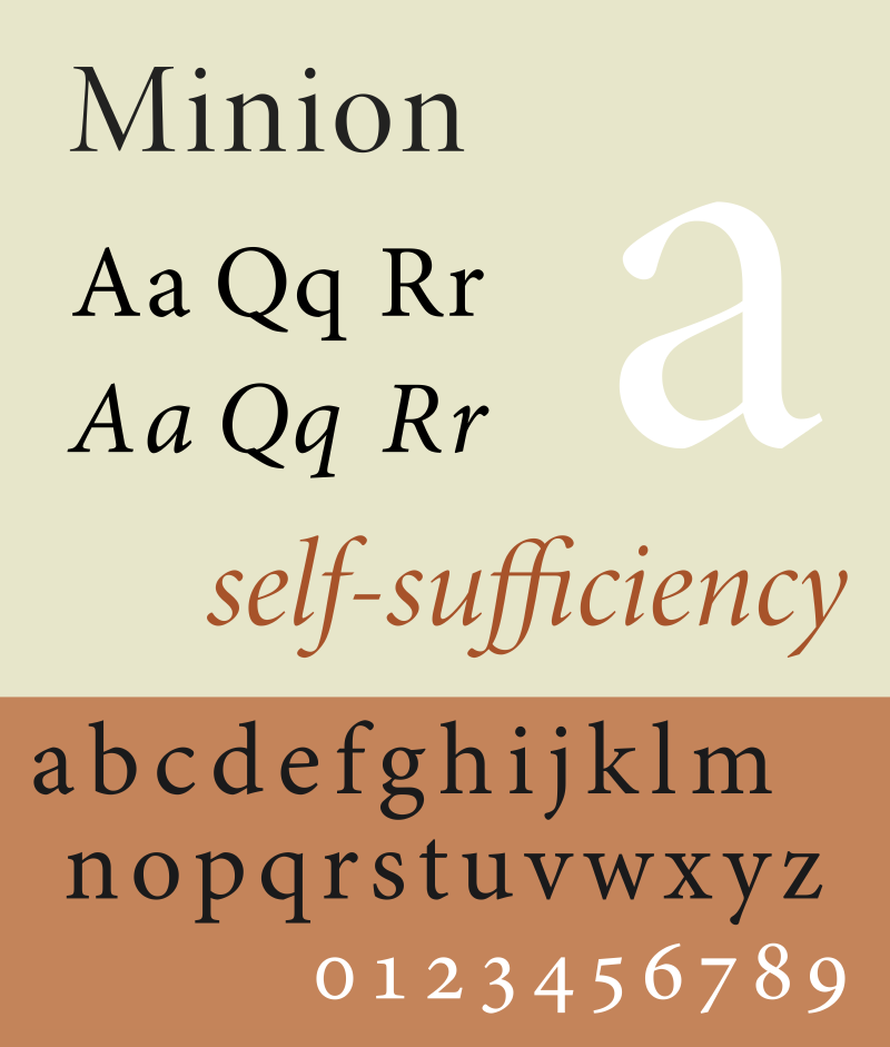 NOT  |
|


