vakhtangchigogidze
**Member** 
Posts: 15
What I collect: classic period issues (1840-1875) from all over the world; errors, oddities, forgeries...
|
Post by vakhtangchigogidze on May 5, 2023 9:54:22 GMT
Hello everyone, Need help on this please... First one is 1851 issue, type 2 (double lines) in my opinion one of the shades of dull red, but i'm not sure. Need help to identify #10a or #11a? (Also... is it possible that its an express postmark?) Other five examples are 1861 issues (all without grill) definately none of them is #64a (pigeon blood pink) but here my knowledge of color identification ends... Maybe one of them is pink? ...Also interested in postmarks, are any of them rare? 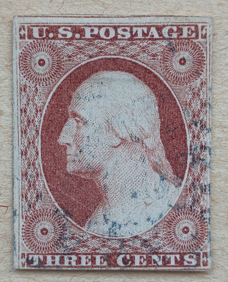 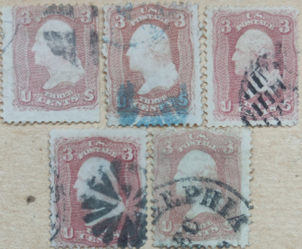 |
|
JeffS
Member 
Posts: 2,610
What I collect: Oranges Philately, US Slogan Cancels, Cape of Good Hope Triangulars, and Texas poster stamps and cinderellas
|
Post by JeffS on May 5, 2023 15:11:05 GMT
Hello, if you are referring to the double line at that top of the first stamp, what you are seeing is the frame line from the once-adjacent stamp above.
As to your question about colors I am afraid I don’t have confidence in your color reproduction. The bottom image overall looks washed out to me.
|
|
|
|
Post by paul1 on May 5, 2023 15:50:31 GMT
here are another half dozen to offer some form of comparison - regret I'm unable to say what the colour was supposed to have been initially since I don't have Scott or any U.S. catalogue, but whatever the catalogues do state there's no doubt this 'pink' appears as a pale image in terms of colour, and poor centring looks to have been commonplace. I've refrained from editing in any form, so what you see here is just how my Leica lens sees these stamps in ordinary daylight. IMHO there appears almost no difference in colour strength between these and the first batch posted, though it's possible these may show a slight improvement in sharpness of image.  |
|
brookbam
Member
APS 236261
Posts: 226
What I collect: US...everything until I decide what I don't want to collect! And now thanks to a TSF give-away I'm adding Space topicals!
|
Post by brookbam on May 5, 2023 16:08:17 GMT
Posting about color questions and getting the right answer is a bit tough over the internet because our monitors are going to show that "dull red" in different shades and hues.
Nice stamp though.
brookbam
|
|
vakhtangchigogidze
**Member**
Posts: 15
What I collect: classic period issues (1840-1875) from all over the world; errors, oddities, forgeries...
|
Post by vakhtangchigogidze on May 5, 2023 16:10:05 GMT
Hello, if you are referring to the double line at that top of the first stamp, what you are seeing is the frame line from the once-adjacent stamp above. As to your question about colors I am afraid I don’t have confidence in your color reproduction. The bottom image overall looks washed out to me. Hi, thanks for reply... i meant the outer frame line at top and botom, which distiguishes type1 from other types (and sorry, just noticed...it was typo, mine is type1) ...about second pic i agree, unfortunatelly i dont have scaner at the moment and using phone... Took a picture on a day ligth and tried to insert all in one pic to compare shades easier. So, thats best i could do... |
|
philatelia
Member
Captain Jack - my best kiloware find ever!
Posts: 3,415
What I collect: Ireland, Japan, Scandy, USA, Venezuela, Vatican, Bermuda, Austria
|
Post by philatelia on May 5, 2023 16:40:28 GMT
I believe that increasing the color saturation makes it easier to see different tints. Color identification has always been difficult for me. I really struggle to make decisions and end up keeping myriad copies of certain issues because I can’t nail down color ID. I believe that part of the problem is that there is no universal color key. Wouldn’t it be nice if all color keys listed the - not sure what to call it - those digital color codes used by computer programs. I wish there was a more accurate method that doesn’t rely on human eyes. here - I cranked up the saturation on your pic and now the two on the left seem more brown, right more pink, yes? 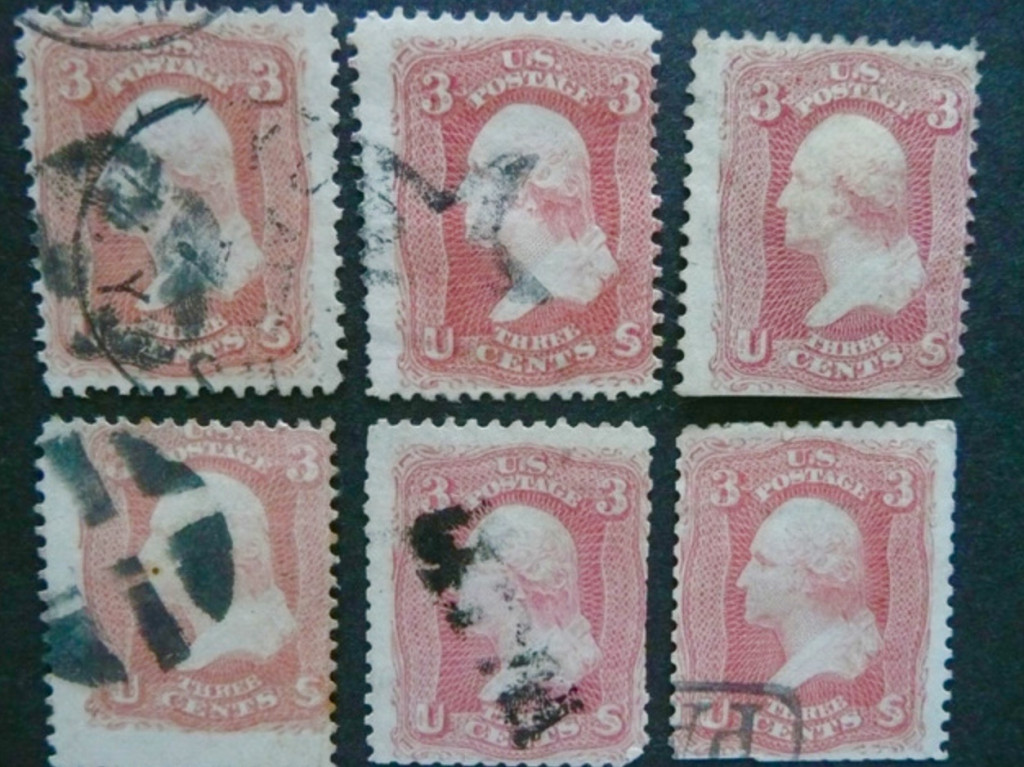 |
|
|
|
Post by paul1 on May 5, 2023 21:28:22 GMT
Hi Terri - cranking up the colour to accentuate the differences appears to have worked here, and agree with your suggestion that the left two appear brownish with the others now appearing more pink. Whether there's a risk of misleading ourselves with this bit of methodology may be a possibility - the degree of shade variation seems a God-sent piece of fun for some folk who love to name the slightest of differences.
I think SG have recently re-issued their Colour Guide - my copy is dated 1969 and sold for five shillings (£0.25p), just prior to the U.K. going decimal.
This colour guide lists, and shows, one hundred named shades/tints based around primary colours and amongst a variety of advice SG offer - when comparing our stamps with their guide - is " .......... comparison should be made in a good North light. (Sunshine is not good). If artificial light must be used, good fluorescent lighting is the best substitute for daylight" - not really sure what North light is, presumably it implies we should avoid the the direct glare as the sun arcs from east, through south, then settling in the west? The suggested way of using this guide is by means of a black card (supplied with the kit) which has a pair of small holes little over 1" apart. Through one you view the stamp in question, and through the other the chosen colour range - presumably adjusting the latter until you see the chart colour that most clearly matches your stamp.
No idea if any other publishers of stamp catalogues have issued anything similar.
All this is to overlook those factors that affect colour, such as sunlight, moisture, heat, so perhaps unreliable for the majority of used stamps that have been soaked and haven't led sheltered lives, all of which detract from whatever the original colour was - then there's the issue of dodgy eyesight for some of us older kids.
P.S. thanks for improving the look of my stamps - perhaps they're worth more now.
|
|
renden
Member
Posts: 8,719  What I collect: World W collector with ++ interests in BNA (Canada etc) and USA
|
Post by renden on May 5, 2023 21:42:29 GMT
Color (colour) is in the eyes of YOU !! the retina has so many receptors - you shall have a different opinion as the multiple references we have success/no success with  René |
|


