gotstamps85
Member  Knee deep in Ebay listings
Posts: 129
What I collect: Classic GB Empire &World
|
Post by gotstamps85 on Aug 17, 2023 20:43:54 GMT
|
|
|
|
Post by smauggie on Aug 17, 2023 20:47:09 GMT
It is a poor facsimilie but a very intriguing one. Why would someone make a facsimilie of that stamp? Maybe postal forgery?
|
|
|
|
Post by paul1 on Aug 17, 2023 21:03:07 GMT
not sure the word facsimile is appropriate for this - if the watermark appears genuine then it's more than likely to be a bona fide stamp albeit having seen vastly better days. Bearing in mind its age it may have been dirty and subsequently washed/cleaned, with the result that colour has weakened and bled - on the other hand are there known forgeries of this low value? Agree, I can't see anyone making a copy, especially including the correct wmk. too. I like the overprint 'DOUANE' - assume it was used for Customs purposes.
|
|
gotstamps85
Member
Knee deep in Ebay listings
Posts: 129
What I collect: Classic GB Empire &World
|
Post by gotstamps85 on Aug 17, 2023 21:56:01 GMT
My first thought was forgery. But the watermark threw me.
|
|
|
|
Post by smauggie on Aug 17, 2023 22:22:39 GMT
And I missed the watermark part, so I am probably wrong.
|
|
khj
Member
Posts: 1,467 
|
Post by khj on Aug 17, 2023 23:32:09 GMT
Your stamp is the later redesigned issue.
In the SG catalog, your stamp will either be South Africa #107a(Oct1946, slate, deep lilac) or #107b(1947, slate, bright violet) or #116(Mar1950, slate-blue, purple). Check to see if only the center is printed with screening (1950 issue, entire design is screen). I can't tell the color variety nor screening from your pic, you'll have to look at the stamp directly. But it does look like you have one of the 107's, since the top of the "2" is clear of the white circle.
|
|
|
|
Post by smauggie on Aug 18, 2023 4:12:47 GMT
Kim to the rescue. Thanks.
|
|
gotstamps85
Member
Knee deep in Ebay listings
Posts: 129
What I collect: Classic GB Empire &World
|
Post by gotstamps85 on Aug 18, 2023 4:21:48 GMT
Your stamp is the later redesigned issue. In the SG catalog, your stamp will either be South Africa #107a(Oct1946, slate, deep lilac) or #107b(1947, slate, bright violet) or #116(Mar1950, slate-blue, purple). Check to see if only the center is printed with screening (1950 issue, entire design is screen). I can't tell the color variety nor screening from your pic, you'll have to look at the stamp directly. But it does look like you have one of the 107's, since the top of the "2" is clear of the white circle. Thanks. Will have another look at it when I next get a chance. 👍 |
|
|
|
Post by paul1 on Aug 18, 2023 22:01:19 GMT
very big thanks to khj for helping with this one and providing some help toward id, though beginning to wish I hadn't been watching  - am well aware of the difficulties with S.A. and the mega amount of flaws etc., but these Union Buildings issues are a real headache, mostly in view of the various colours/shades. Separating the recess/intaglio from the later rotogravure isn't too difficult - in the picture attached showing the example of the '2d.' value touching the white circle, the diagonal lines of square dots of roto. can be seen clearly, as opposed to the typical lines of engraving in recess - roto seems to give an image less sharp than recess, and almost makes the vignette look like an old b. & w. photograph - hope my understanding correct. This photographic appearance of the vignette can be seen better in the pair of English/Africaans stamps in the photograph, attached - unfortunately, they're umm so there's no hope of a date to help with deciding which SG No. - alongside this pair someone had written 'blue violet and dull blue. I don't see a reference in SG catalogue singling out the circle and value touching as a variety - not that it matters. SG 34 from March 1927 appears to be the original issue with the Union Buildings design, and I've photographed a group of five which I believe show this first effort - at least the date on one of them reads 1928, and they do all have a very similar colourway and the entire design looks to be recess. Lastly, I've added a group of strong violet coloured examples - all with roto vignette - I suspect they may be either SG 107a or 107b as you've already suggested - they're similar in colour to gotstamps85 example. I'm sure the u/c SUID AFRIKA is a larger font than on the others in that picture.     |
|
khj
Member
Posts: 1,467
|
Post by khj on Aug 18, 2023 23:22:15 GMT
I don't see a reference in SG catalogue singling out the circle and value touching as a variety - not that it matters. My memory has degraded quite bit this past year. I recalled it was a footnote in one of the SG catalogs. But it is possible I misread or misunderstood the footnote (that won't be the first time that has happened!!!). I'll look for the footnote when I return in about 4 hours. |
|
khj
Member
Posts: 1,467
|
Post by khj on Aug 19, 2023 4:25:16 GMT
From 2020 SG Commonwealth & British Empire catalogue: 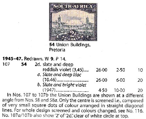 |
|
|
|
Post by paul1 on Aug 19, 2023 8:02:33 GMT
thanks for checking for me khj - good to see one of us is on the ball. I have over thirty examples of this design - in one form or another and from different dates, and we could sit here all night debating the almost endless variation - flaws and colour. Not sure I fully understand the meaning of ... 'No. 107a/107b also show '2' of '2d.' clear of white circle at top' - the vast majority my examples show the figure 2 being clear of the white circle, and I think there are only two which do truly connect. The original SG 34 recess stamp was a good looking design and colour - IMHO the roto process and the deep purple of later stamps detract from the quality/appearance of the original 1927 design, and the roto printing looks to cause the colour bleeding which is seen commonly on later stamps.
Thanks again for checking for me.
|
|
gotstamps85
Member
Knee deep in Ebay listings
Posts: 129
What I collect: Classic GB Empire &World
|
Post by gotstamps85 on Aug 22, 2023 6:16:17 GMT
Yes, thanks for that. I'd spent ages looking through that same catalogue and missed the listing entirely. Wood for the trees and all that lol.
I agree the 1927 No. 34 is a better looking stamp. 👍
|
|


 - am well aware of the difficulties with S.A. and the mega amount of flaws etc., but these Union Buildings issues are a real headache, mostly in view of the various colours/shades.