|
|
Post by PostmasterGS on Mar 1, 2023 19:22:41 GMT
I quickly learned that when they scrolled through their slides that there was to be absolutely NO frame movement as the slides went through the presentation. The frame being the border around the presentation. Maybe it's my days of preparing PPTs for general officers, but I still have this pet peeve. Bad. For my album pages, I use masters (which you can do in InDesign, PPT, etc.) to make sure the elements that are static across all pages don't vary by even a pixel. For the elements for which the content changes from slide to slide, but which should still be positioned consistently, I export the album pages to PDF, then zoom in tight on each part of the page and page-up/down watching for the flicker of something moving that shouldn't be. Even though once printed, you'd never be able to see the difference. |
|
|
|
Post by PostmasterGS on Mar 1, 2023 17:02:01 GMT
Found a local paper store. The guy told me paper mills have not made any colored paper in close to 2 years. Whatever is in the supply channels is all there is. I was having a lot of difficulty finding my paper (Neenah Exact Vellum Bristol, 8.5x11, 67 lb, Cream) last year, at the same time I was preparing to redesign/reprint all my pages. I usually bought off Amazon, but it was perpetually out of stock. Ditto Office Depot, Staples, etc. And it's still out of stock to this day. I think it may be end-of-life for that paper/type/color/weight combo. Luckily, my local paper supplier, a Lindenmeyer-Munroe affiliate, found some in stock at their Dallas affiliate that they could have next-day, so I bought 10 cartons (80 reams/40,000 sheets). That should last me a while! |
|
|
|
Post by PostmasterGS on Mar 1, 2023 16:11:37 GMT
I recently had to replace my long serving printer as well.
Back when I was still using Schaubek-sized paper, I bought an HP CP5225DN Color Laserjet because it was the only color laser I could find at the time that would do the larger paper. It lasted 13 years and tens of thousands of pages. It had been a real pain in the butt the last few years -- with a laser printer, eventually the toner dust gets into every portion of the innards, and it's difficult to get it all out. I was getting little spots of toner in random places on my pages, which I could deal with, but then the controller board finally gave up and I was unable to print more than 1 page without cycling the power.
I shopped for a newer model replacement, and first purchased a Brother color laserjet. This was a gamble, because the printer wasn't listed as being able to support the heavier paper I use for my pages. One print with that one showed it was a mistake -- the finer fonts on my pages came out too thin and blurry. So, I gave that one to family who needed a new printer, and started shopping again.
In the end, I ended up buying the same HP model again. Shockingly, HP still sells it after all these years, as it is still their only "professional" color laserjet that is listed as supporting heavier paper. It means doing without a lot of the nice new features (WiFi connectivity being the big one), but it does print really beautifully.
|
|
|
|
Post by PostmasterGS on Feb 8, 2023 1:52:55 GMT
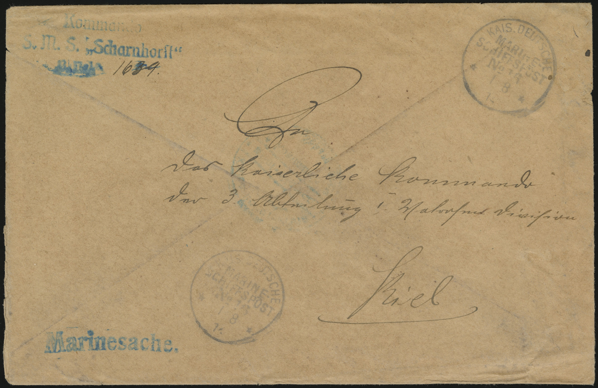
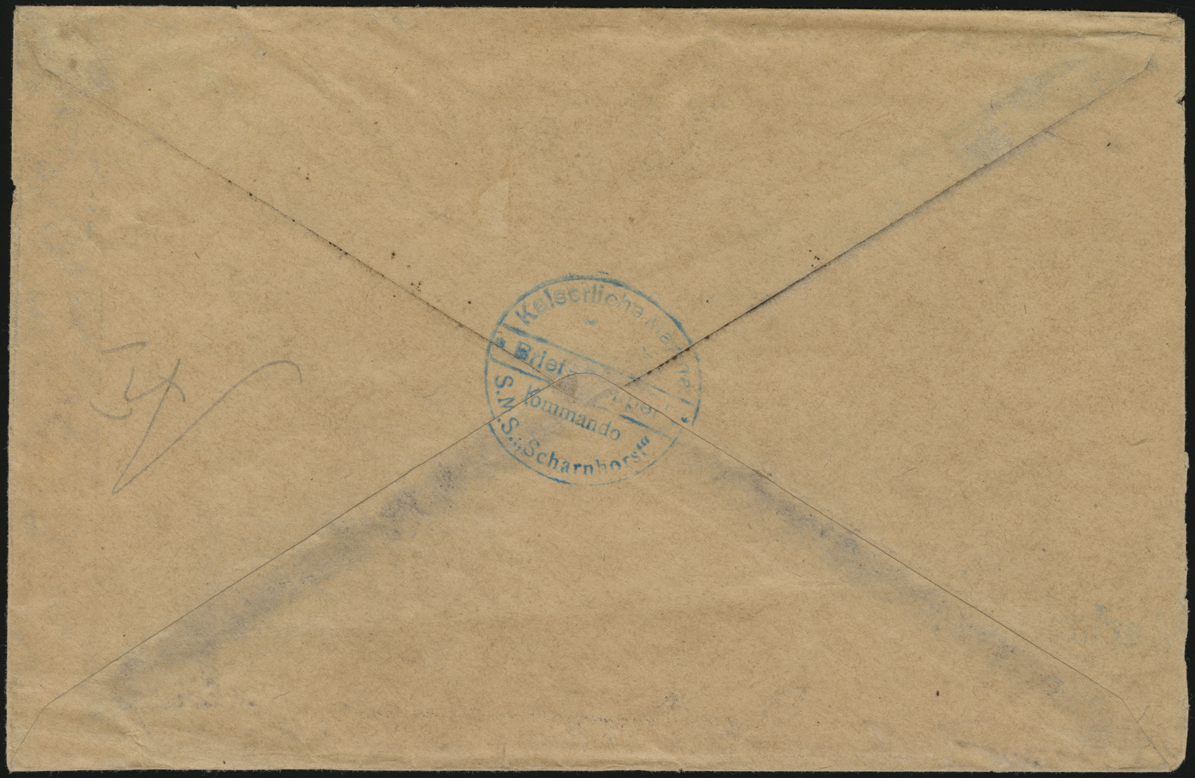
Got another nice addition to this collection yesterday. I mentioned above that the returned items had notes attached explaining the circumstances in order to avoid additional postage fees upon delivery in 1923. There was an exception to this practice. Also included in the buried mail were several items of official naval mail -- mail from the officers of the ships to offices of the German Navy back in Germany. There wasn't a requirement to attach postage to official mail transported within the German Navy, so there was no need to worry about imposition of additional postage fees in 1923. As a result, these items didn't receive the buried mail notices. This makes them much harder to ID, and much less desirable/cheaper in the collecting market despite being significantly rarer that buried mail pieces from private senders. This item was sent from the cruiser S.M.S. Scharnhorst (MSP No. 16) to the Kaiserliche Kommando das 3. Abteiling, I. Matrosen Division (Imperial Command of the 3rd Section, 1st Sailors Division), in Kiel. It can be IDed as a buried mail item due to the date of the cancel and the "A1" pencil mark on the rear which was applied when the buried mail was being processed in Germany.  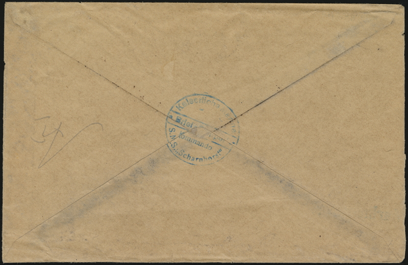 Additionally, this item was certified as being a buried mail item by Friedrich Crüsemann, who was the source of most of our current knowledge regarding Marine-Schiffspost up to WWI. |
|
|
|
Post by PostmasterGS on Feb 3, 2023 18:47:40 GMT
Did you crop the photos after scanning or by drawing a different scan box in your scanner software? If the second, that could explain it.
|
|
|
|
Post by PostmasterGS on Feb 3, 2023 17:40:10 GMT
Scanners will typically have more accurate colors in the center as opposed to the edges.
|
|
|
|
Post by PostmasterGS on Jan 30, 2023 8:27:54 GMT
for whatever reason I cannot access stampsx.com - comes back as FORBIDDEN 403 (this has happened before) I had this happen when I lived in Japan. I could access it from my home Internet, but if I tried over cellular I got a 403. I think they’ve blocked certain IP address ranges. If you want to, I can post a support question there, but I’d need to know your IP address. |
|
|
|
Post by PostmasterGS on Jan 30, 2023 3:55:35 GMT
I’ll note that all of the above except the Sich-2 stamp are available on eBay in small quantities, with prices to match. Particularly the Nature Reserve sheelet. If you’re a Ukraine collector and a completionist, better get them now.
|
|
|
|
Post by PostmasterGS on Dec 18, 2022 18:43:34 GMT
Wouldn't be that hard to make a similar app for Mac based upon the framework I use for PMGS StampFix and PMGS Reveal. Can't help the Linux folks, though.
|
|
|
|
Post by PostmasterGS on Dec 14, 2022 18:30:05 GMT
Concur that it's likely from a newspaper. There were ads on private postcards of the time, but the ink wouldn't come off that cleanly from professionally made postcards.
|
|
|
|
Post by PostmasterGS on Dec 6, 2022 22:17:33 GMT
Since I get a lot of requests for certain areas that I've yet to build pages for, I've added a block on the webpage to show what I'm currently working on and the ETA.  I know this won't really cut down on the requests — everyone wants the area they're working on moved to the top of the queue — but it will hopefully give folks an idea of why I'm not immediately able to meet their requests. |
|
|
|
Post by PostmasterGS on Dec 4, 2022 22:14:03 GMT
I set my TSF bookmark to the Recent Threads page instead of the Home Page. Can't recall the last time I even visited the Home Page. |
|
|
|
Post by PostmasterGS on Dec 3, 2022 22:55:58 GMT
I added a new feature to Postmark Reveal today. You'll now have the option of bulk downloading some or all of the resulting images. 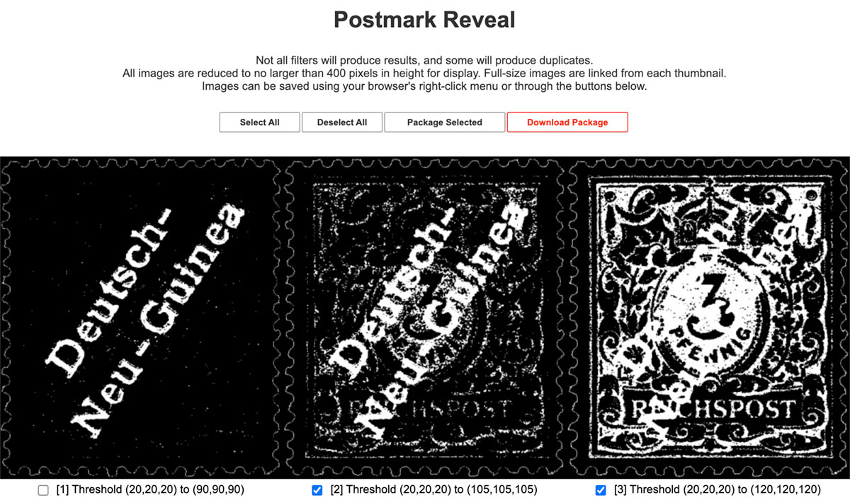 You can select/deselect all images using the buttons at the top, or individually select images using the checkboxes under the images. Then click the Package Selected button to package them up and the Download Package button to download them -- this is a two-step process because it's considerably easier to code that way. |
|
|
|
Post by PostmasterGS on Nov 28, 2022 13:39:27 GMT
A few things to consider. Used copies of the "b" color are exceptionally rare -- current CV of €14,000 -- so skepticism is certainly warranted. Judging the color on a used stamp is also more difficult because the stamp is more likely to have been altered by environmental factors either through use or soaking. The color on this should be considerably lighter than the "a" shade, and the ink is poorly applied, leading to a porous appearance. Of note, there are frequently "porous" spots on the "a" color as well, so that's not dispositive.
As to my opinion on this stamp, it appears to be a lighter shade than the others, and there is some evidence of it having porous spots. However, there is some discoloration in the center of the design that indicates this stamp might have seen some form of color alteration, either intentionally or through environmental factors. You'd need to send it to an expert who can do a more thorough exam to be sure.
|
|
|
|
Post by PostmasterGS on Nov 26, 2022 21:05:46 GMT
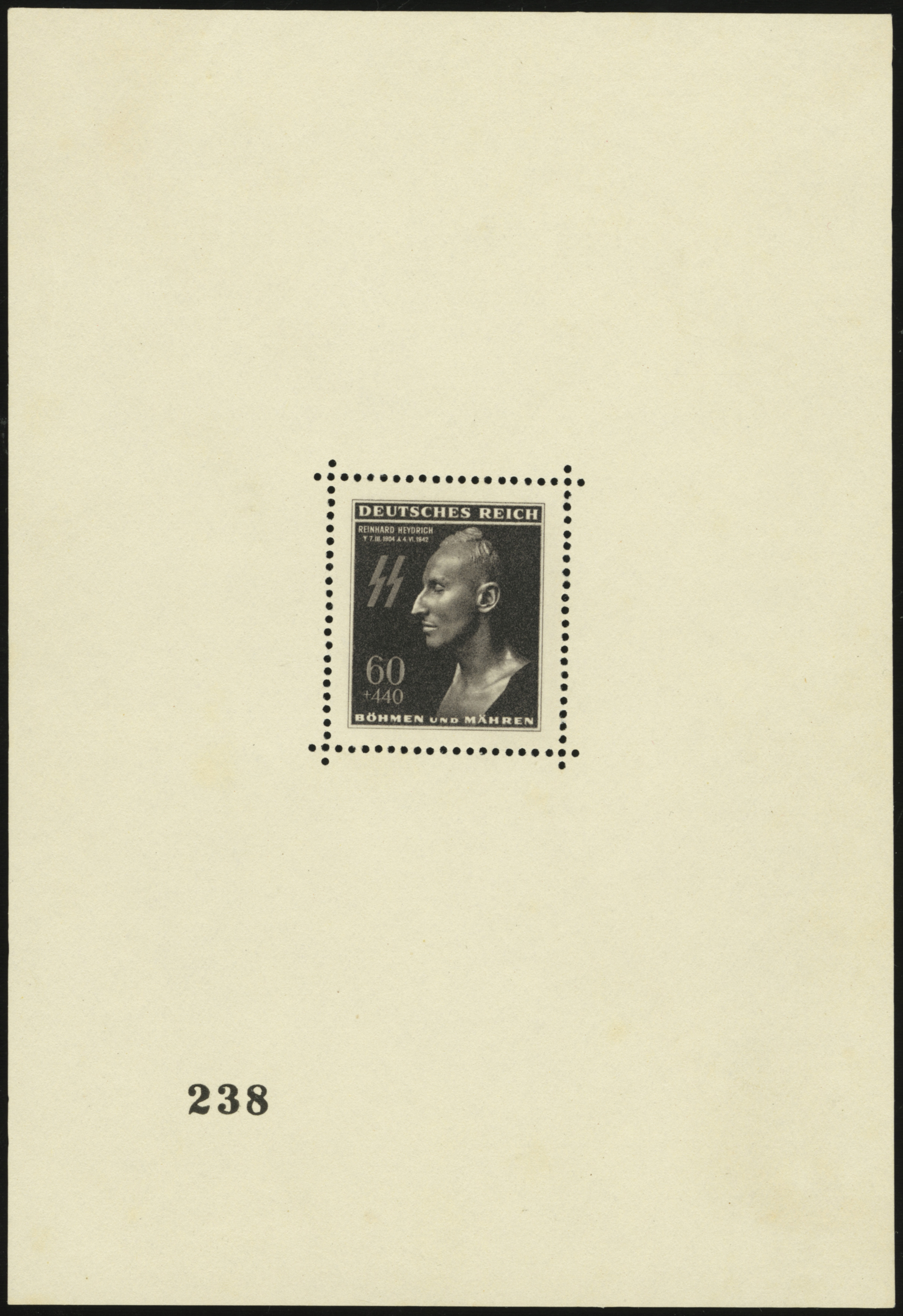
The sheet isn't a cinderella. It's Bohemia & Moravia MiNr. Block I, with the individual stamp being MiNr. 131. Here are the latest English (2016) and German-language (2022) Michel listings. 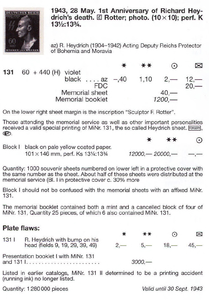 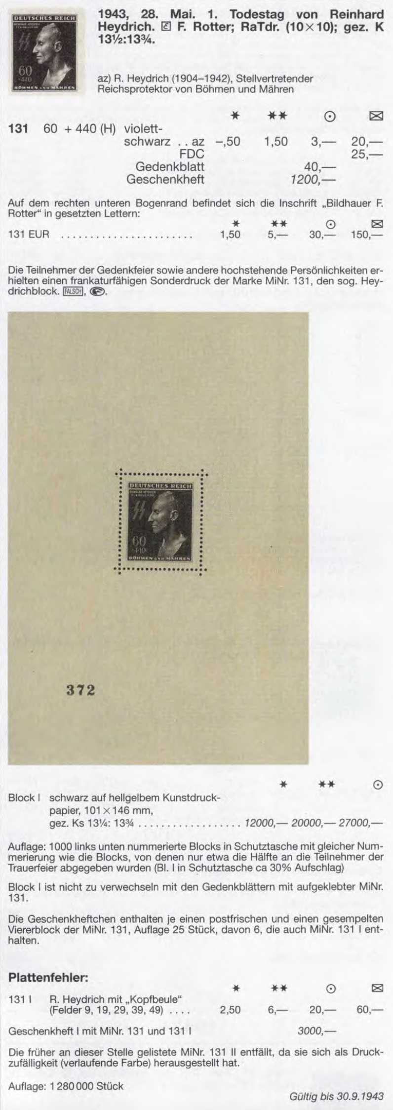 |
|
|
|
Post by PostmasterGS on Nov 26, 2022 13:18:44 GMT
Now that I'm back on my computer instead of mobile, here are some detailed shots of my sheet. 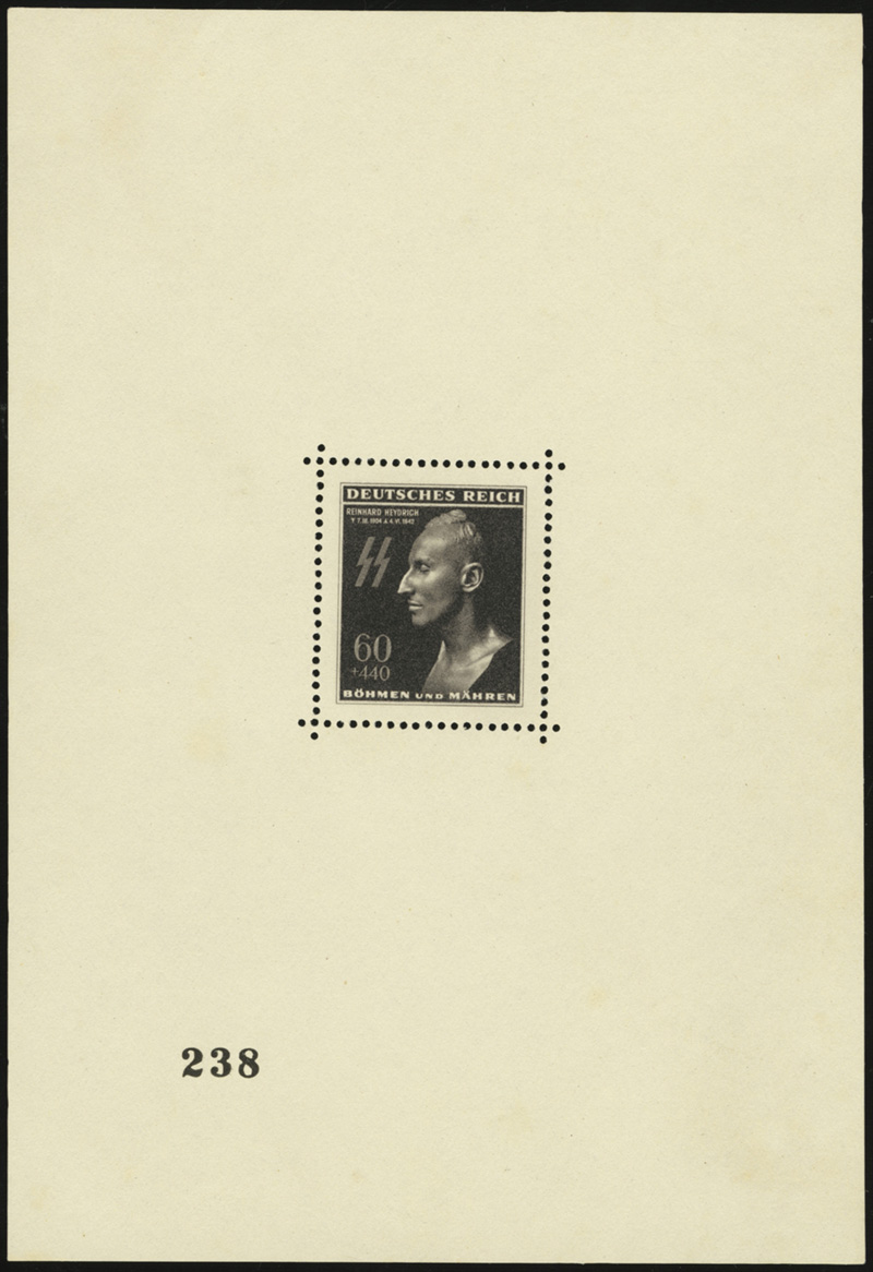 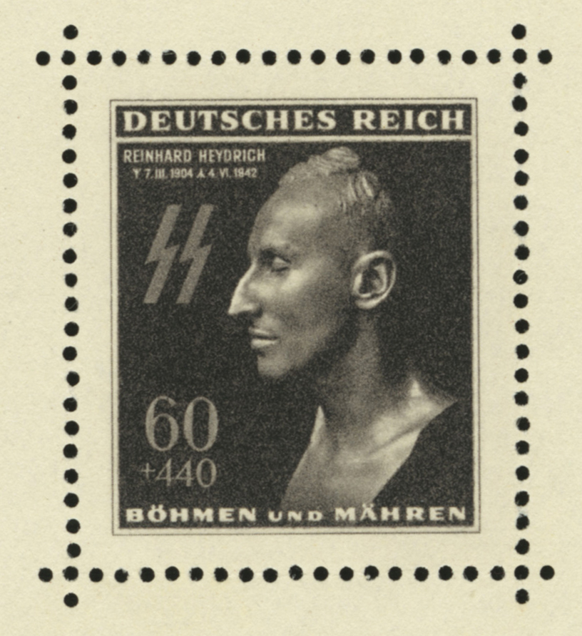 Note the shade of the paper, which should be a light yellow, and the details of the finer printing, particularly in the dates, border lines, and the thinner parts of the larger letters ("E" & "T" in "DEUTSCHES REICH"). khj , Unfortunately it's without gum, but at the time that was the only way I could afford one, and it's hard to justify investing in another one considering all the other juicy items out there begging for me to blow thousands on them. |
|
|
|
Post by PostmasterGS on Nov 26, 2022 4:28:39 GMT
|
|
|
|
Post by PostmasterGS on Nov 15, 2022 16:58:46 GMT
New version (v1.62) uploaded. This is a bug fix version. With v1.60, I added the ability to have the resolution properly set in the metadata if generating TIFF files. Or so I thought. TIFF files can store resolution metadata in multiple ways. The method I was using in v1.60 to store the resolution in the metadata -- as the number of pixels per mm -- was the easier solution, but forced an app or OS opening the image to do some math to convert pixels/mm to pixels/in. Apparently, there are variations in how different apps and operating systems handle the rounding of infinitely repeating decimals when they do math, causing an annoying "bug". I scan my stamps at 1200ppi, and when I opened the resulting images in Photoshop, Gimp, or Windows, the resolution was properly shown as 1200ppi. But in MacOS, which is my main OS, they showed as 1199ppi (actually, 1199.9999 repeating). My OCD couldn't let that go. I think that's fixed now. As always, download is here. |
|
|
|
Post by PostmasterGS on Nov 14, 2022 22:09:38 GMT
This is one of the reasons why all my pages are of an offset design -- meaning the border is offset to the right (to accommodate binder ring holes) and to the bottom (to accommodate the title). I found that no matter what I did, with a Canon S9000 inkjet and then an HP CP5225dn color laserjet, I couldn't get a consistent result WRT the border placement. By having it offset, it's not as obvious.
I found that even if the feed path was perfectly straight (Canon S9000) or if I used the manual feed tray to minimize the feed path (HP CP5225dn), I still couldn't get consistent results. All it takes is the tiniest slip of a single feed roller and the page will print offset or slightly crooked. I've learned to live with some of my hardcopy pages being slightly off, though I admittedly correct them in the digital scans before I post them to my website.
|
|
|
|
Post by PostmasterGS on Nov 13, 2022 16:06:57 GMT
I'd love to help, but the handwriting is very difficult. I've started using a service to get translations of my old German items, but due to the cost ($30-$40/item), only for my most valuable items.
|
|
|
|
Post by PostmasterGS on Nov 11, 2022 22:04:37 GMT
Andy, Only additional suggestion I would make would be to shift the texts blocks in the vertical to balance the spacing at these four points. As it is, you've got more space above and below the line, but are running up against the stamp boxes.  |
|
|
|
Post by PostmasterGS on Nov 8, 2022 17:45:40 GMT
Here’s another neat one from the collection — The Wittekind Provisionals of 1901. During the period in which Germany had colonies in Africa and the Pacific, German naval vessels had on-board post office to serve the postal needs of the crews. These on-board post-offices used Marine-Schiffspost (MSP, or Naval Ship Post) cancellers which used unique numbers, allowing modern collectors to easily ID the ship of origin and its location at the time the cancel was applied. In the early 20th Century, Germany needed to transport large numbers of military personnel to and from its colony in Kiautschou, China, both because Kiautschou was the HQ of the East Asia Cruiser Squadron, and because of the Boxer Rebellion. To move these troops, Germany would frequently charter civilian steamers from the German shipping lines. To accommodate the postal needs of the troops embarked, the German navy would issue a MSP canceller to the civilian steamer. However, for reasons that remain unknown, on 15 July 1901, the steamer Wittekind of the Norddeutscher Line departed Bremerhaven for China without an MSP canceller. On-board were 1,216 men of the Ostasiatische Besatzungsbrigade (East Asian Occupation Brigade). 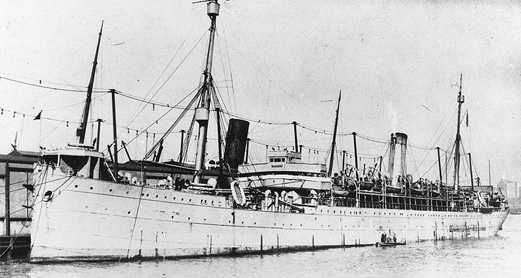 Wittekind Wittekind, in later U.S. service as SS Freedom, 1919 Their mail was not required to be franked with a stamp, as due to the Boxer Rebellion, military feldpost was free until 31 August 1901. However, it was required to have a postal marking — typically, this would have been the MSP cancel of the on-board PO, but they had no such canceller onboard. So, a stamp bearing the seal of the Ostasiatische Besatzungsbrigade Ablösungskommando des 2. Transportbataillon (Detached Command of the 2nd Transport Battalion, East Asian Occupation Brigade) was used instead. This postcard is dated 25 July 1901, while the Wittekind was nearing Port Said, Egypt. It’s from Musketeer Schacht to his mother, Anna, in Dresden. 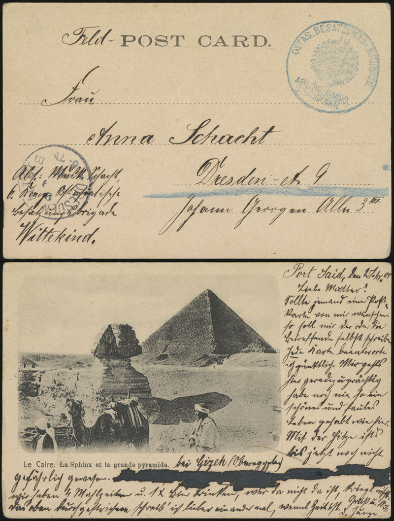 This postcard is dated 10 August 1901, while the Wittekind was off Columbo, Ceylon. It’s from Wilhelm Schmidt to his sister, Minna, in Cottbus. 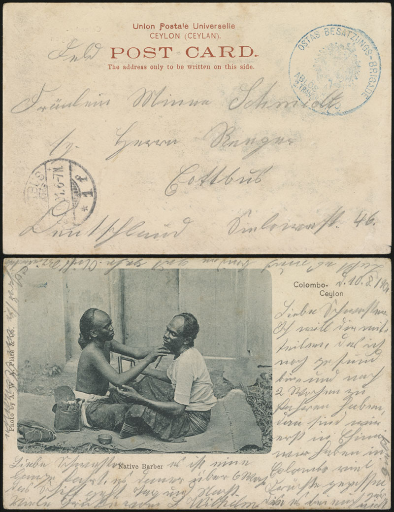 The number of pieces of mail cancelled in this manner is unknown, but at least 20 pieces are known. The possible date range is from 15 July to 27 August 1901, as the Wittekind did receive an MSP canceller for its homeward voyage. |
|
|
|
Post by PostmasterGS on Nov 7, 2022 16:55:19 GMT
Just a heads-up that Postmark Reveal will be a little sporadic over the next week or so. I've moving all my websites to a dedicated server, and it'll be up-and-down until everything's moved and reconfigured.
|
|
|
|
Post by PostmasterGS on Nov 6, 2022 22:44:35 GMT
The wingtips are the easiest way to ID these, if you can't see the shield itself. #1, #2, & #4 the sheild is clearly visible. For the rest, just look at the wingtips.
|
|
|
|
Post by PostmasterGS on Nov 6, 2022 22:27:00 GMT
Large, Small, Large
Large, Small, Large
|
|
|
|
Post by PostmasterGS on Oct 27, 2022 19:46:22 GMT
New version (v1.60) uploaded. This version fixes the lack of resolution data (DPI) in TIFF files. When you save as a TIFF, the resolution should now be correctly reflected in the metadata. This was a major pain to do, so please let me know if it doesn't behave as you expect. I had previously managed to get the DPI working with PNG and JPG, so this leaves BMP as the only one of the common scanner output formats that doesn't receive the proper DPI, and I doubt it ever will. BMP is virtually impossible to write metadata to without an insane level of coding. As always, download is here. |
|
|
|
Post by PostmasterGS on Oct 21, 2022 12:38:38 GMT
I just realized I’ve been derelict in posting updates here since I added the option for users to subscribe for updates, so here’s what’s been added in the last few months. As usual, all are available in Basic/Specialized, with/without stamp photos, StGB compliant/non-compliant (where applicable), and in Letter, A4, Schaubeck, and Leuchtturm/Lighthouse sizes. WWII Occupations - Ostland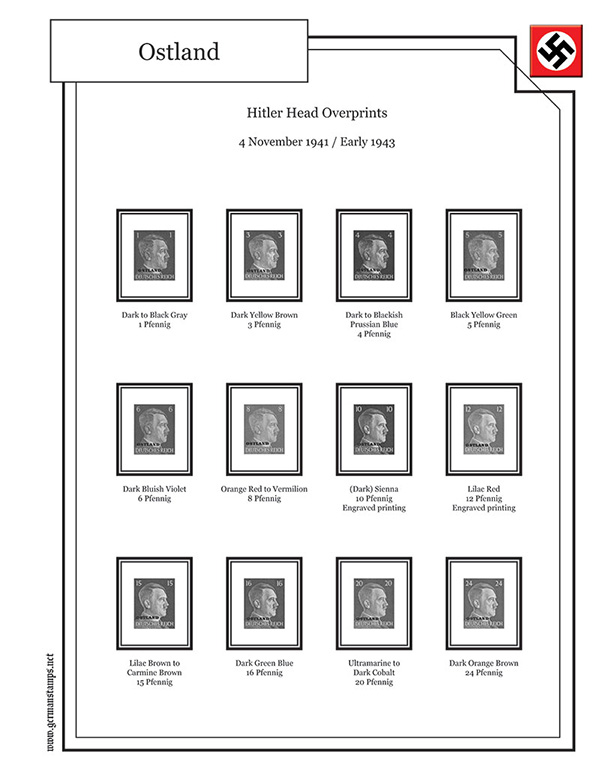 Feldpost of WWII Feldpost of WWII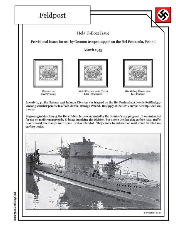 Foreign Volunteer Legions of WWII Foreign Volunteer Legions of WWII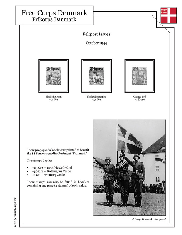 Additionally, going forward, when I include plate flaws, overprint flaws, etc., on the Specializied pages, I’m including the plate position of the flaws, if known. As part of this change, I’m going back and adding it to previously-completed pages. So far, I’ve done the German Colonies in German New Guinea and the Mashall Islands. 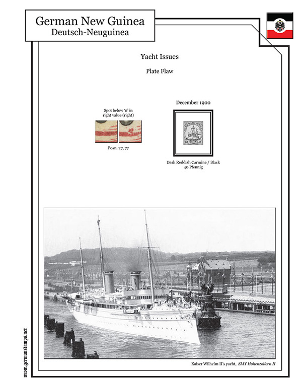 As always, downloads are here. |
|
|
|
Post by PostmasterGS on Oct 17, 2022 16:01:43 GMT
I like it like it is. To me, it would be more distracting having extra space around the mount than it would be having different sized boxes. If you typically add a set amount around the stamp (ex. 3 mm), do that for all rather than attempting to make the boxes the same size regardless of the stamp sizes.
|
|
|
|
Post by PostmasterGS on Oct 17, 2022 4:03:03 GMT
Andy,
Looks good. You might try combining paragraphs 2 & 3 to buy yourself enough space to move the bottom text up and keep the last paragraph from crowding the Foreign Mail - W title at bottom.
|
|
|
|
Post by PostmasterGS on Oct 3, 2022 3:00:21 GMT
Andy Pastuszak, One variation you might try is flipping the bottom half of the second design I posted -- put the vertical stamp at left and the text and horizontal stamp at right. Moving the text to the right is another subtle way to distinguish it from the text above.
|
|