Admin
Administrator 
Posts: 2,676
|
Post by Admin on Aug 20, 2015 2:39:44 GMT
You will find a new search box at the bottom of the page.
This is powered by Google and will bring only search results for TSF.
I have been taking random string of text and using the search box I am getting good results.
I think you will find this feature very handy.
I took the text Caisse Populaire Savings Stamps which are in the Canada Cindy and the search engine brought me to page 6 of the thread with the post about them. it seems to be very powerful.
|
|
khj
Member 
Posts: 1,524 
|
Post by khj on Aug 20, 2015 17:15:12 GMT
Nice!
On my screen, it also appears at the top, just below the menu bar and the thread pathname.
However, the text entry line for the Google custom search is so wide that it pushes the "Search" button almost entirely past the black right border (you can see a small part of the left side of the search button).
The Google custom search at the bottom does not have this problem on my screen. In fact, the text entry window is actually very short (~ 1/3 window width).
k
|
|
Admin
Administrator 
Posts: 2,676
|
Post by Admin on Aug 20, 2015 17:23:07 GMT
I just placed the Google search in the top header, very same code as the bottom footer. I to a little baffeled as to why its so wide. Same code should be the same No?
All this techy stuff.
I looked at the forum in both internet explorer and chrome and I having no problems seeing the Google search , I also looked in different themes and seeing it in Little man.
|
|
khj
Member 
Posts: 1,524 
|
Post by khj on Aug 20, 2015 17:30:08 GMT
I will post a screenshot of the top and bottom searchboxes as they appear on my screen...
Meanwhile, there should be some parameter thingie that allows you to scale it according to the width of the user window, but yes, too techie for me as well.
|
|
khj
Member 
Posts: 1,524 
|
Post by khj on Aug 20, 2015 17:38:51 GMT
Sorry if I posted this in the wrong thread. Feel free to move it or shift it to a new thread... I am using Firefox 40.0.2 and here is the top search bar that is pushed off to the right: 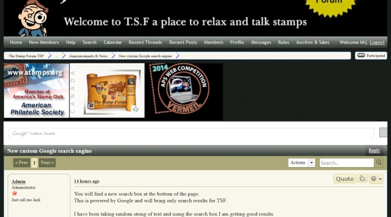 and here is the bottom search bar that appears OK: 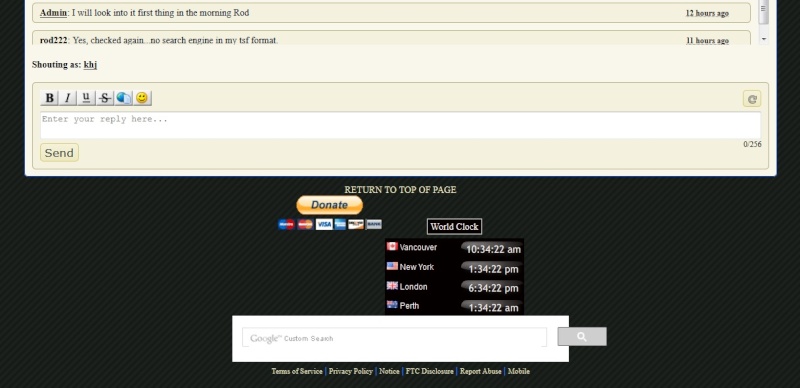 |
|
Admin
Administrator 
Posts: 2,676
|
Post by Admin on Aug 20, 2015 17:40:37 GMT
Here is the code
<script>
(function() {
var cx = '003890047031720304301:djv-rp9rp4i';
var gcse = document.createElement('script');
gcse.type = 'text/javascript';
gcse.async = true;
gcse.src = (document.location.protocol == 'https:' ? 'https:' : 'http:') +
'//cse.google.com/cse.js?cx=' + cx;
var s = document.getElementsByTagName('script')[0];
s.parentNode.insertBefore(gcse, s);
})();
</script>
<gcse:search></gcse:search>
In the footer (bottom) I have the following code inserted
The red text is the world clock
<div style="margin: 15px 0px 0px; text-align: center; display: inline-block;"><div style="margin: 0px 0px 5px; padding: 2px 4px; border: 1px solid rgb(204, 204, 204); border-image: none; text-align: center; display: inline-block; background-color: rgb(5, 0, 0);"><a style="color: rgb(251, 243, 243); font-size: 13px; text-decoration: none;" href="http://localtimes.info/difference">World Clock</a></div><script src="http://localtimes.info/world_clock2.php?&cp1_Hex=fbf3f3&cp2_Hex=050000&cp3_Hex=000000&fwdt=88&ham=0&hbg=0&hfg=0&sid=0&mon=0&wek=0&wkf=0&sep=0&widget_number=11000&lcid=CAXX0518,USNY0996,UKXX0085,ASXX0089" type="text/javascript">null</script></div><table width="470">
<tr><td>
<script>
(function() {
var cx = '003890047031720304301:djv-rp9rp4i';
var gcse = document.createElement('script');
gcse.type = 'text/javascript';
gcse.async = true;
gcse.src = (document.location.protocol == 'https:' ? 'https:' : 'http:') +
'//cse.google.com/cse.js?cx=' + cx;
var s = document.getElementsByTagName('script')[0];
s.parentNode.insertBefore(gcse, s);
})();
</script>
<gcse:search></gcse:search>
|
|
Admin
Administrator 
Posts: 2,676
|
Post by Admin on Aug 20, 2015 17:43:11 GMT
Sorry if I posted this in the wrong thread. Feel free to move it or shift it to a new thread... I am using Firefox 40.0.2 and here is the top search bar that is pushed off to the right:  and here is the bottom search bar that appears OK:  Right thread Kim That's what I see too. I going to try a few tricks today to see if I can compact the top search box. It really does a good job of searching the forum. |
|
khj
Member 
Posts: 1,524 
|
Post by khj on Aug 20, 2015 17:49:00 GMT
It does a great job. Thanks for putting it in. I find the ProBoards search engine too cumbersome/tedious to use, so this is great.
|
|
Admin
Administrator 
Posts: 2,676
|
Post by Admin on Aug 20, 2015 17:51:10 GMT
It does a great job. Thanks for putting it in. I find the ProBoards search engine too cumbersome/tedious to use, so this is great. The Probards search is a complete pile of ................ |
|
Ryan
Moderator  Calgary, Alberta, Canada
Posts: 2,749  What I collect: If I have a catalogue for it, I collect it. And I have many catalogues ....
|
Post by Ryan on Aug 20, 2015 23:49:31 GMT
I just placed the Google search in the top header, very same code as the bottom footer. I to a little baffeled as to why its so wide. Same code should be the same No? All this techy stuff. I looked at the forum in both internet explorer and chrome and I having no problems seeing the Google search , I also looked in different themes and seeing it in Little man. I use the most current version of Chrome but with a different theme than khj - my theme has the montage of classic stamps for a graphic background. Like Kim, my bottom search bar is short and the top search bar is so long that the button containing the magnifying glass that you can click to start the search is pushed almost entirely off the right side of the display. There's a little bit of the button still visible but you can't see the magnifying glass. The top bar still works, I just hit the enter key instead of clicking on the magnifying glass. I can see why the search bar in the footer is shorter - a table has been opened with one row and one cell (and never closed) with a width of 470 pixels, and the Google search bar is in that table. The following code is added at the end of the red text you have used to highlight the World Clock code: <table width="470">
<tr><td>Because the table was never closed, anything after that bottom search bar would also be restricted to only 470 pixels wide, if the page had more stuff down there. You need the following to close the table. </td></tr></table>Kim's default font must be smaller than mine - the "Terms of Service / Privacy Policy / Notice /" blah blah blah all fits on a single line under his search box, but I have a larger default font and my blah blah blah has to fit on two lines because it's too long to fit under the restriction of 470 pixels. 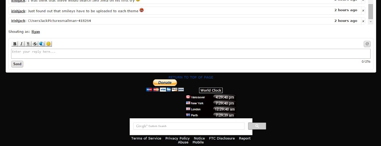 The quick and dirty fix will be to also put the top search bar in a table, I suppose. Try this code at both top and bottom. Change the "470" if you want a different length on the search bar. (You don't need to duplicate the code to open the table - that extra code in the red text for your World Clock should be deleted.) <table width="470"><tr><td>
<script>
(function() {
var cx = '003890047031720304301:djv-rp9rp4i';
var gcse = document.createElement('script');
gcse.type = 'text/javascript';
gcse.async = true;
gcse.src = (document.location.protocol == 'https:' ? 'https:' : 'http:') +
'//cse.google.com/cse.js?cx=' + cx;
var s = document.getElementsByTagName('script')[0];
s.parentNode.insertBefore(gcse, s);
})();
</script>
<gcse:search></gcse:search>
</td></tr></table>Ryan |
|
Jerry B
Departed
Rest in Peace
Marietta, Georgia USA
Posts: 1,485 
|
Post by Jerry B on Aug 21, 2015 10:20:11 GMT
Hi I tried the new search box and found articles I was interested in but did not know they were there. It could be placed a little lower if possible. Also, the word Relevance is missing the final "e". Regarding the adding of smilies. I did write up a way to get other smilies into posts: thestampforum.boards.net/thread/3204/add-smiley-standardI realize now that a problem could occur if Planet Smilies, or any other, site goes away. I tried "Save Image As:" and that seemed to work. However, animated smilies did not work when imported to WORD. Maybe a thread, or something, can be formed with nothing but "user smilies"? Just a thought. In Lieu of that I guess they could be saved on Photobucket. Jerry B |
|
tomiseksj
Moderator  Woodbridge, Virginia, USA
Posts: 6,385  What I collect: Worldwide stamps/covers, Cinderellas, Ohio Prepaid Sales Tax Receipts, U.S. WWII Ration ephemera
|
Post by tomiseksj on Aug 21, 2015 12:06:33 GMT
For any users of the Ghostery software, enabling the tracker "Google AJAX Search API" will allow the Google search boxes to appear.
|
|
cjd
Member 
Posts: 1,107 
|
Post by cjd on Aug 21, 2015 15:11:52 GMT
Ghostery was hiding them from me...thanks, Steve. It is a great addition.
It would be nice to be able to resize the top one, but I don't know how to do it, either, so I won't throw stones.
|
|
|
|
Post by irishjack on Aug 21, 2015 16:47:38 GMT
That Admin was at it again.
You will now find a button on the navigation bar called TSF Google search
This will bring you to a google search engine just for this forum, I hope this solves the problem for members that cant see the search boxes
I will look into sorting the size of the top search box.
I thinking of removing the current images and adding a table of say 3 sections, place the Google search in one of them and APS in another.
The 3rd one we could use for upcoming events.
|
|
khj
Member 
Posts: 1,524 
|
Post by khj on Aug 21, 2015 17:56:44 GMT
Actually, I preferred having the search bar already there, even if the button was partially off the screen. One less click (I'm inherently lazy).
Also, now I get the following appearing in 2 places -- just below the thread pathname and also just below the GCS search bar:
table width="470">
That wasn't there before you added the link.
|
|
|
|
Post by irishjack on Aug 21, 2015 19:01:32 GMT
Actually, I preferred having the search bar already there, even if the button was partially off the screen. One less click (I'm inherently lazy). Also, now I get the following appearing in 2 places -- just below the thread pathname and also just below the GCS search bar: table width="470"> That wasn't there before you added the link. The table width="470"> is now gone. Bear with me over the next day, I will get to the bottom of this. I can always buy the advance GSE but the lowest priced package is $100 per year and a rough draft of the numbers we could be looking at $350 a year or more. We will suffer with the free GSE. |
|
tomiseksj
Moderator  Woodbridge, Virginia, USA
Posts: 6,385  What I collect: Worldwide stamps/covers, Cinderellas, Ohio Prepaid Sales Tax Receipts, U.S. WWII Ration ephemera
|
Post by tomiseksj on Aug 21, 2015 19:24:35 GMT
...You will now find a button on the navigation bar called TSF Google search This will bring you to a google search engine just for this forum, I hope this solves the problem for members that cant see the search boxes... Members who can't see the search boxes because they are using Ghostery will be able to see the GSE page when selected from the menu bar but will not be able to see any search results unless they unblock the Google search tracker...and doing so would allow them to see the two search boxes, negating the need to have the menu option. |
|
khj
Member 
Posts: 1,524 
|
Post by khj on Aug 21, 2015 19:41:49 GMT
I'd say the free GSE is more than sufficient. Thanks for adding it!
|
|
Londonbus1
Moderator  Cinderella Stamp Club Member 3059
Posts: 5,064  What I collect: Wonderland; 1912 Jubilee International Stamp Exhibition, London ('Ideal' Stamp, ephemera); French Cinderellas with an emphasis on Poster Stamps; Israel and Palestine Cinderellas ; Jewish National Fund Stamps, Labels and Tags; London 2010, A Festival of Stamps (anything); South Africa 1937 Coronation issue of KGVI, singles or bi-lingual pairs.
|
Post by Londonbus1 on Aug 21, 2015 20:16:13 GMT
Computers are just amazing !! We all seem to get different results and views. I love it ! 
I am getting both the search boxes and the 'new' button on the navigation bar. I didn't have to do anything. But now my partially 'black screen', mentioned on another thread, is worse because it happens when I scroll up as well. Now it is very irritating and I am sure it has nothing to do with the search boxes, just a coincidence.
To make it more interesting, when I left click the mouse but keep my finger on it and pull down the scroll bar there is no black screen !!!  Of course that is not practical but just a recent development because up to the time of the search boxes I could not do it without the black screen. That said, I am sure there is no connection it's just this [fairly] new computer being a pain in the butt !! Of course that is not practical but just a recent development because up to the time of the search boxes I could not do it without the black screen. That said, I am sure there is no connection it's just this [fairly] new computer being a pain in the butt !! 
I am using IE11. Chrome is very difficult to use at the moment, I have not found a solution for that yet.
I use the 'Little Man' screen and the only change since the search boxes is that the 3 'ads' [APS,TSF etc.] are now in the middle of the screen instead of left side.
Tomorrow my computer whizz will be visiting so I hope I can sort out some or all of the problems........the black screen being top of the list. |
|
khj
Member 
Posts: 1,524 
|
Post by khj on Aug 21, 2015 21:47:00 GMT
Better the black screen than the old MS Blue Screen of Death.
|
|
cjd
Member 
Posts: 1,107 
|
Post by cjd on Aug 22, 2015 1:55:07 GMT
The "old" blue screen of death? Oh, believe me, it is still alive and well.
Jack, I can't imagine what the $100/$350 would buy in improvements to the current box...free sounds fine to me.
|
|
Admin
Administrator 
Posts: 2,676
|
Post by Admin on Aug 22, 2015 2:42:52 GMT
The "old" blue screen of death? Oh, believe me, it is still alive and well. Jack, I can't imagine what the $100/$350 would buy in improvements to the current box...free sounds fine to me. I like Free, enough bills to pay without adding a further cost  |
|
Admin
Administrator 
Posts: 2,676
|
Post by Admin on Aug 22, 2015 3:30:01 GMT
I will be playing around with code and sorting out the Google search engine, so if you see a sudden appearance or disappearance of something don't get to alarm. Admin is in the sandbox playing this weekend
|
|
Londonbus1
Moderator  Cinderella Stamp Club Member 3059
Posts: 5,064  What I collect: Wonderland; 1912 Jubilee International Stamp Exhibition, London ('Ideal' Stamp, ephemera); French Cinderellas with an emphasis on Poster Stamps; Israel and Palestine Cinderellas ; Jewish National Fund Stamps, Labels and Tags; London 2010, A Festival of Stamps (anything); South Africa 1937 Coronation issue of KGVI, singles or bi-lingual pairs.
|
Post by Londonbus1 on Aug 22, 2015 6:45:55 GMT
Better the black screen than the old MS Blue Screen of Death. I am not acquainted with the MS Blue screen of Death but this Black Screen from Hell is getting worse. This morning, it is almost impossible to scroll with any sense of joy on the forum. I am off to look for a site using Proboards to see if there is a connection. As I said earlier, It is ONLY happening on TSF.

|
|
rod222
Member 
Posts: 11,043  What I collect: Worldwide Stamps, Ephemera and Catalogues
|
Post by rod222 on Aug 22, 2015 7:34:00 GMT
Wow! well done Admin !
Did the Ghostery fix, and tried the Google search...amazing.
Well done you.
|
|
Jerry B
Departed
Rest in Peace
Marietta, Georgia USA
Posts: 1,485 
|
Post by Jerry B on Aug 22, 2015 9:13:15 GMT
Hi Admin
One quickie. Why not just leave the button, bottom also, and no search boxes?
Also, if possible, when one clicks the "TSF Search" button have the search open in a new tab. One could do that by right clicking the button and choosing "open in new tab" but I would think opening in a new tab would be more convenient.
Jerry B
|
|
|
|
Post by irishjack on Aug 22, 2015 14:38:04 GMT
Wow! well done Admin ! Did the Ghostery fix, and tried the Google search...amazing. Well done you. I thought you would like it, much better then the Probards.
Jerry I leaning towards just leaving the bottom search box and getting rid of the top box. Having the TSF GSE in the tool bar is enough I think.
|
|
|
|
Post by irishjack on Aug 22, 2015 14:49:15 GMT
Better the black screen than the old MS Blue Screen of Death. I am not acquainted with the MS Blue screen of Death but this Black Screen from Hell is getting worse. This morning, it is almost impossible to scroll with any sense of joy on the forum. I am off to look for a site using Proboards to see if there is a connection. As I said earlier, It is ONLY happening on TSF.

I have removed the top GSE box, has this helped?
Try a different theme, if you log off you will be a guest and will see the default theme called TSF2.0, I wondering if its the theme that's causing issiue. Also are you using a tablet type laptop? |
|