angore
Member 
Posts: 5,363  What I collect: WW, focus on British Empire
|
Post by angore on Oct 12, 2020 12:03:17 GMT
Scott is a generalist catalog so any country / regional catalogs will always be more complete for specialist.
The album page (pre-printed or custom) design question comes into play when decide to how to deal with the varieties. Do you keep them in one group with all the possible variations (shades, dies, overprints, etc). Is it hierarchical or more a flat organization? It is the hierarchical approach that is challenging. Specialized catalogs may not have an album page design in mind like Scott.
Do you want a closed system (meaning there is a point of completeness) or open (space to expand)?
|
|
vikingeck
Member
Posts: 3,269
What I collect: Samoa, Tobacco theme, Mail in Wartime, anything odd and unusual!
|
Post by vikingeck on Oct 12, 2020 13:56:25 GMT
Chris if I might make a suggestion re your comment at the start concerning the PB& Co printing “ used a chemical wash that tinted the paper blue “ ....
It is my understanding it was actually a constituent of the ink , prussiate of potash , potassium ferrocyanide, which reacted with the damp paper.
Areas with little ink , a paler background such as the figure of Hope , or the Queen’s Head in GB penny red and twopence blue, from the same printer who also did the first Columbus issues for Chile , show up white on the back of the stamp . In GB we call it an Ivory Head , .......... I don’t know what it is called on the Cape Triangle. “ ivory Hope?” Or what ?
|
|
Beryllium Guy
Moderator 
Posts: 5,661
What I collect: Worldwide Stamps 1840-1930
|
Post by Beryllium Guy on Oct 12, 2020 19:41:47 GMT
Many thanks for your comments, Alex ( vikingeck ). Your point is well taken. I will amend the earlier post. In re-reading the source material, I am not sure why I wrote it was a wash being used. It was late when I made the post! According the Stevenson book though, it does state that it is unclear if the ferrocyanide was present in the ink or the paper, so I will re-phrase my post along those lines. Interestingly, it also states that the bluing effect was unintended, and that the potassium ferrocyanide was put there to help prevent the removal of cancellations by chemical methods. So, it was a sort of precursor to the water-soluble (fugitive) inks that came later. Thanks for mentioning this, Alex. According to what I have seen posted by knowledgeable specialists (experts) on other websites, it seems that the term "Ivory Head" can also be used to describe Cape Triangles on which the bluing has left a white area in the middle on the back of the stamp. It is clearly not a "head", but as the effect is similar to that seen in earlier GB stamps in which the image was the reverse of a head, it seems that the term is applicable. Yet another tidbit of cocktail party knowledge, I would say. Well, certain cocktail parties, anyway.... In any case, thanks for the constructive comments. I will amend the earlier post, and then move on to the next in sequence.  |
|
Beryllium Guy
Moderator
Posts: 5,661
What I collect: Worldwide Stamps 1840-1930
|
Post by Beryllium Guy on Oct 12, 2020 22:24:15 GMT
Identifying Cape of Good Hope Triangle Issues
The Beginning, 1853 (cont'd)It should be mentioned that the 1-penny and 4-pence were the original COGH triangle issues. The 6-pence and 1-shilling did not appear until later. As stated before, the presence of blueing in the first place, and then differentiating between more or less blueing, would seem to be the way to identify these issues. 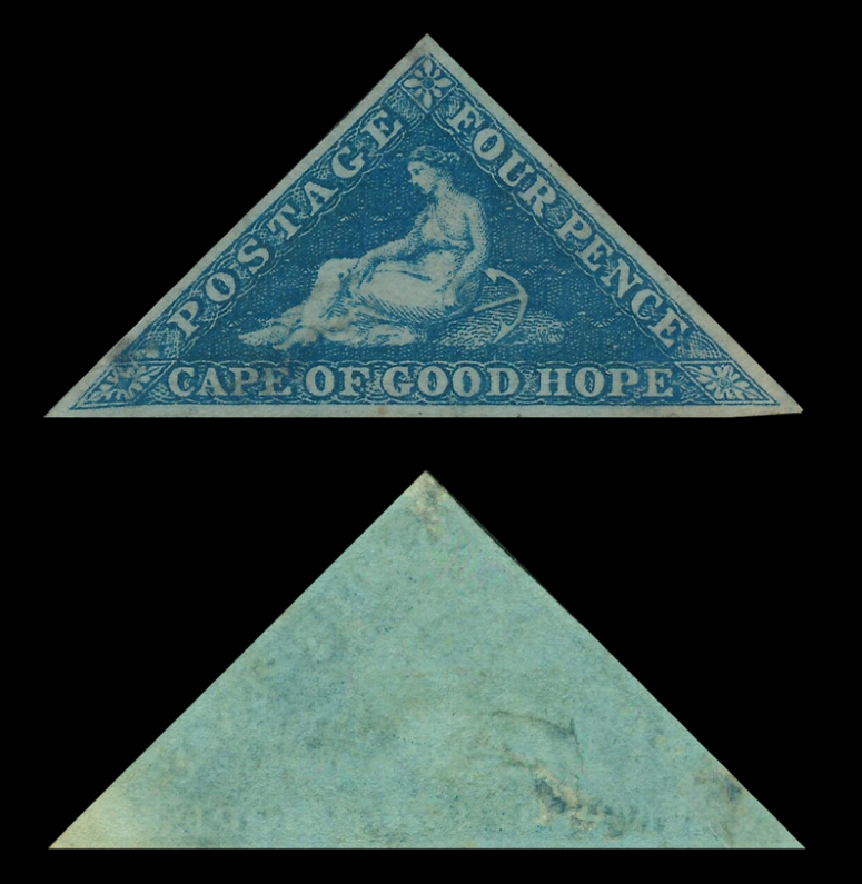 COGH, SG2 (Sc2a), 4-pence Deep Blue on Deeply Blued Paper 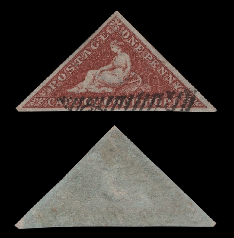 COGH, SG3 (Sc1) 1-penny Brick Red on Slightly Blued Paper (from my collection) 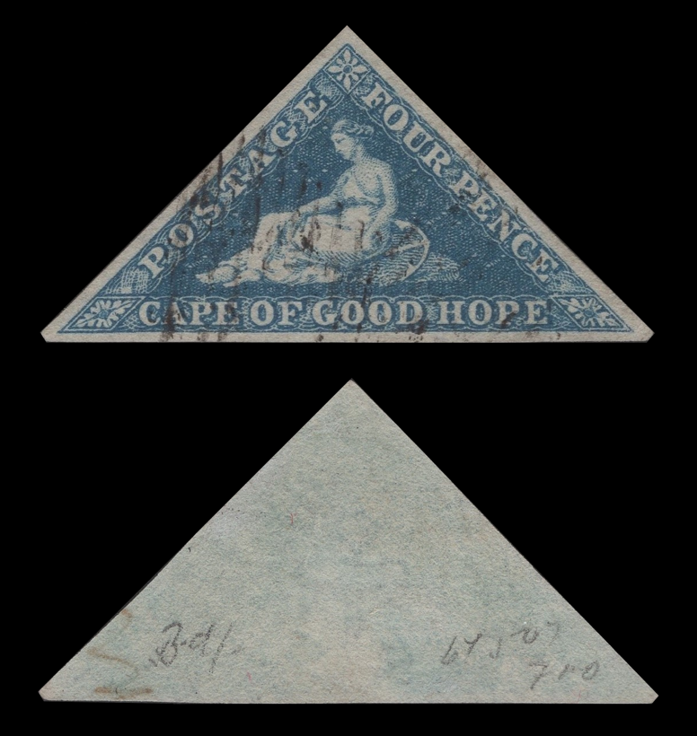 COGH, SG4 (Sc2) 4-pence Deep Blue on Slightly Blued Paper (from my collection) Comments & Observations: The first stamp shown at the top of this post was the best example image of an SG2 that I could find: deep blue in color with deeply blued paper. The two following stamps are both from my collection, the back of the 1-penny brick red appears quite blue when viewed in natural light with the unaided eye, but it is not as pronounced as the examples of SG1 and SG1a that I found on auction sites, so I have concluded that it is much more likely an SG3 or possibly SG3a, which would be brown red as opposed to brick red. To me, it looks brick red, so I am identifying it as SG3. Revision: I have replaced the image for the SG4 since communicating with Richard Debney, noted expert on COGH triangles. It seems that almost ironically, in order for the stamp to show "Slightly Blued Paper" on the back, the paper itself actually seems more white in character than any of the other possibilities. I will go into this in further detail in the later post that shows a comparison of multiple copies of the 4-pence blue issues. But for the moment, the identification of the above example is confirmed by a recognized authority. Will continue with more of the Perkins Bacon printings of these stamps in the next posts, hopefully in the next day or so. 
|
|
Beryllium Guy
Moderator
Posts: 5,661
What I collect: Worldwide Stamps 1840-1930
|
Post by Beryllium Guy on Oct 13, 2020 20:53:42 GMT
Bluing on the Early COGH TrianglesAs shown in the previous posts, and its source clarified based on comments from Alex ( vikingeck ), bluing is the key element in identifying the first COGH Triangles (SG1-SG4). Based on commentary in the book, The Triangular Stamps of Cape of Good Hope by D. Alan Stevenson, published in 1950, we know that the bluing is due to the use of potassium ferrocyanide in the printing process, the purpose of which was to prevent the removal of cancellations from the stamps by chemical methods. Stevenson wrote: *It should be noted that in his book, Stevenson states that "For many years collectors supposed that their blueing was due to the action of the gum on the printing inks or on the paper, but it is clear now that the cause lay in the introduction of potassium prussiate, the old name for potassium cyanide, or ferrocyanide, into the inks of the paper." Further research shows that actually potassium cyanide and potassium ferrocyanide are not the same compound, and that the reference to potassium ferrocyanide, also referred to as prussiate of potash, is the correct technical term. Almost as if on cue, I found this pair of COGH blued triangles on eBay today: 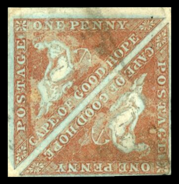 COGH, SG3 Pair with blotchy surface appearance, potentially due to an attempt at one time to chemically remove the cancellation I contacted the eBay seller to enquire about the condition of these stamps, and he confirmed that the blotchy appearance was not just an artifact of the scan, but actually the condition of the surface of the stamps. My guess, and it is only a guess, is that this could be an illustration of exactly what Stevenson wrote about in the book, that an attempt to remove a cancellation by use of chemicals was made on this pair of stamps, resulting in what you can see in the image. Additional belated note: I would like to express my sincere thanks to Morten ( classicalstamps ) for making it possible for me to get a copy of the Stevenson book, which has been an invaluable resource in studying the COGH Triangles.
|
|
|
|
Post by classicalstamps on Oct 14, 2020 6:20:11 GMT
My pleasure, Chris  Armed with the right knowledge, collecting becomes that more interesting! |
|
blaamand
Member
Currently creating custom pages until 1940.
Posts: 1,459
What I collect: Worldwide - Stamps and Postmarks - not enough time...
|
Post by blaamand on Oct 14, 2020 9:03:28 GMT
Beryllium Guy - Chris, I just want to say I have really enjoyed all your posts on the Cape triangles. It's must be someone that's an engineer at heart behind this very methodical and analytical, yet clear and down-to-earth study. Excellent, please keep it going! I want to support your case with the 4d on slightly blued paper which does not look like it on the screen. I had almost the same, a triangle that in real life looked rather bluish, but when a photo was re-produced on a screen that bluish tinge is not to be seen. The use of potassium ferrocyanide, which reacted with the damp paper and created the bluing off the paper is quite fascinating. Just as a curiosity I would like to mention that similar paper was also used on a few classic Brazilian stamps, this is a snip from my DIY pages (click for a better resolution):  Thanks to Morten from myself as well, for supporting you with material for this little exploration down south. I could not agree more in what you said about the challenge to seperate Perkins Beacon and DLR printings!  Some copies of the triangles just seem to be an intermediate state in between the clear and crisp print of Perkins Beacon and the more blurred of DLR. I will be watching this space to see if any secrets are revealed about identification! Big thanks for this great work
|
|
Beryllium Guy
Moderator
Posts: 5,661
What I collect: Worldwide Stamps 1840-1930
|
Post by Beryllium Guy on Oct 24, 2020 8:35:41 GMT
Identifying Cape of Good Hope Triangle Issues
The Later Perkins Bacon Printings, 1855-1859
The next round of COGH triangle printings is done largely on "white paper" (Gibbons and Scott catalogue descriptions), as opposed to the blued paper which characterizes SG1-SG4. The reason that I have written the words "white paper" using quote marks is because, as Stevenson points out in his book: Below is a combination of reference images from other sources, as well as some from my own collection. Color shades play a major role in identifying these issues, but this is not so easy to do well using images from multiple sources, all using different scanners. All of the images from my collection have been scanned on the same machine using the same settings, so at least there is some consistency there.  COGH, SG5a (Sc3), 1-penny Rose on Cream Paper (some listings indicate White Paper) Other color varieties: SG5 (Sc3b) Brick Red, SG5b Deep Rose Red, Sc3a Dull Red One-Penny Varieties (SG5)
The most commonly encountered variety of this stamp seems to be the SG5a in Rose color, but there is also SG5b Deep Rose Red. I have seen a few images that appear to be this deeper shade, but it is very difficult to tell comparing scans from different sources. Some examples are very pale, and could easily be color changelings that have been faded from exposure to sunlight or altered by chemical means. Cleaning of postmarks was a much more common practice back in the 1850s-1860s, and I have seen many examples posted in online sites that show evidence of chemical cleaning, but this is rarely acknowledged by the sellers, as it would certainly depress the price. SG5 is listed as Brick Red on Cream Paper, and it would seem to be the rarest of the SG5 varieties, especially if the catalogue value is any indication. I have not seen an image in any of the online sources that looked like a genuine example meeting this color and paper description. If I come across one at some point, I will post it in this thread.  COGH, SG6 (Sc4b), 4-pence Deep Blue on White Paper (now from the collection of Morten classicalstamps)  COGH, SG6a (Sc4), 4-pence Blue on White Paper (from my collection) Other color varieties: Sc4e Bright Blue Four-Pence Varieties (SG6)
Absolutely the most common of all COGH triangles are the 4-pence blues. Although SG only lists two color varieties, Blue and Deep Blue, it seems to me that there are many shades of these. The examples shown above from my collection were incorrectly identified by their sellers, but these identifications are now confirmed by COGH triangle expert Richard Debney. Edit: Originally, I thought that both of these stamps were possibly SG4 (Slightly Blued Paper) rather than varieties of SG6, but these are now correctly identified. It seems to me that in order to be identified as an SG4, the stamp paper needs to be more white in actual color, in order to show the blueing on the back, which has a more distinctive "robin's egg" shade to it, at least to my eye. It has been confirmed to me that stamps with paper showing brownish or yellowish, like the first 4-pence example above are clearly considered as "white" paper and are SG6. The more difficult ones are the second 4-pence example, with paper showing dark blue overtones that are apparently either blue ink residue from the printing process, or the image on the front showing through. Stamps like this one were construed to be on blued paper by me, but according to Richard Debney, these are also considered to be "white" paper, so are therefore varieties of SG6 rather than SG4. Opinions and comments are welcome!
|
|
Beryllium Guy
Moderator
Posts: 5,661
What I collect: Worldwide Stamps 1840-1930
|
Post by Beryllium Guy on Oct 24, 2020 9:07:20 GMT
Identifying Cape of Good Hope Triangle Issues
The Later Perkins Bacon Printings, 1855-1859 (cont'd)
Due to the fact that in most cases I have only one example of any given COGH triangle, I don't really have a great basis for making decisions about the color varieties. I think the only real way to do this well would be to have enough of the actual stamps all in one place to enable a true side-by-side comparison. There are, of course, other challenges in getting the color varieties correct, one of which I have noticed is that the color variety names are different from one catalogue to the next.  COGH, SG7 (Sc5a), 6-pence Pale Rose Lilac on White Paper (from my collection)  COGH, SG7c (Sc5b), 6-pence Slate Lilac on Blued Paper Other color varieties: SG7b Deep Rose Lilac on White Paper, SG7d Slate Purple on Blued Paper Six-Pence Varieties (SG7)The most difficult COGH triangle to find in good condition seems to be the 6-pence. From the Perkins Bacon printings, there are two color varieties of Rose Lilac, and two with grayish overtones, which SG calls Slate. The other big problem with these stamps seems to be that the lilac color is very susceptible to fading, and many of the examples offered online are seriously faded. Due to all the faded examples around, I find it difficult to distinguish between Pale and Deep Rose Lilac shades. I say this because when I see an image labelled as Pale, I don't know whether it is really the Pale variety, or simply a faded color changeling. For identifying my copy above, I settled on SG7 Pale Rose Lilac based on the catalogue value for this unused copy, as the CV for an unused SG7b is almost double. When in doubt, I assume the less valuable possibility. Having said all that, the color hardly seems Pale to me, but this was my logic, anyway. I should also mention the presence of some brownish spots on the SG7 shown above. According to another online specialist source, the brown spots or evidence of toning is to be expected to some extent on copies of these stamps, especially unused examples with original gum, as my example is. 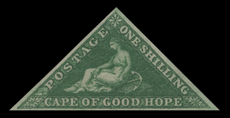 COGH, SG8b (Sc6a), 1-shilling Deep Dark Green on White Paper (from my collection) Other color varieties: SG8 (Sc6) Bright Yellow Green on White Paper One-Shilling Varieties (SG8)My logic in identifying the above 1-shilling copy is pretty much the same as what I used for the 6-pence from my collection. To me, this stamp appears more Yellow Green than Deep Dark Green, but the CV for an unused SG8 versus SG8b is almost 10x greater, so I figured it must be the SG8b, even though images I have seen online appear darker green than mine. Comments and opinions welcome!
|
|
Beryllium Guy
Moderator
Posts: 5,661
What I collect: Worldwide Stamps 1840-1930
|
Post by Beryllium Guy on Oct 24, 2020 10:58:35 GMT
Identifying Cape of Good Hope Triangle Issues
Summary of the Perkins Bacon Printings (1853-1859)
Once again, Stevenson gives a very nice quick reference for varieties of these stamps:
I will take a break now to do some other stamp activities, and will eventually come back to this thread with posts about the later printings of these stamps by De La Rue. I do not plan to make any posts about the rare and expensive "Woodblock" issues (referred to by Stevenson as Issue II), as these are not commonly encountered by most collectors.
|
|
vikingeck
Member
Posts: 3,269
What I collect: Samoa, Tobacco theme, Mail in Wartime, anything odd and unusual!
|
Post by vikingeck on Oct 24, 2020 12:07:17 GMT
Here are my very first Cape triangles. A whole new venture for me. I must be going mad even to consider it at my age! Quote Copy from Chris, Beryllium Guy , above " 1853. 1d. (a) Brown-red shades on paper more or less blued: (1) uniformly, (2) with cameo or ivory heads, (3) framed, or (4) mottled."
  The Previous owner has pencilled "1 I w a" on the back whatever that means? (Some others he has as "Ix" and "Iy"; does that mean anything to anyone?) Does the stamp correspond to SG1 pale brick red? And do we consider the blueing deeply blue and a) uniformly or d) mottled ? My second Example is poor with no margins and is held temporarily for reference only before listing on eBay in the future.   Similar colour to the previous, but less blueing and hints of the "cameo" or "Ivory Head", so SG1, type (b) as in the note above. This was listed as "1x" |
|
Beryllium Guy
Moderator
Posts: 5,661
What I collect: Worldwide Stamps 1840-1930
|
Post by Beryllium Guy on Oct 24, 2020 12:47:31 GMT
Great stuff, Alex ( vikingeck ).... I have been waiting to see what you had gotten! Some nice stuff, apparently! OK, here are my best guesses, based on what I have seen: First Image- I agree that this image looks like an SG1, Pale Brick Red to me, with deeply blued paper
- As for the back of the first image, I would say that it appears mottled to me, with slight evidence of the cameo, but there
- Also, as a side comment, it is an excellent image of the anchor watermark
- As for the "1 Iwa" notation, I am not sure; I wondered if it may have anything to do with plating of the stamp, but the notation is not consistent with Stevenson
Second Image- I agree that this image also looks like an SG1 to me
- The paper is a bit less blued than the first example, but I think still qualifies as deeply blued, making it an SG1
- On the back of this stamp, it seems more uniformly blued to me, with clear evidence of the cameo
- As a slight side comment, this stamp looks like it was cleaned to me, meaning that someone used chemical means to remove or lighten the cancel; look at the face of "Hope", her eye seems to be the only feature, and it just appears as a single dot. In this context, it should be remembered that the purpose of the cyanide compound that results in the blueing was to make it apparent when stamps had been tampered with, to use Stevenson's words.
 Left: Figure of "Hope" on Alex's SG1 (2nd example), which appears cleaned to me Right: Figure of "Hope" from my own SG3, which shows much more detail Alex, I congratulate you on scoring what appears to be two copies of SG1 to me. Well done to you, as in my experience, those are not so easy to come by. Other opinions are welcome, of course. I am looking forward to seeing what else you have acquired! |
|
vikingeck
Member
Posts: 3,269
What I collect: Samoa, Tobacco theme, Mail in Wartime, anything odd and unusual!
|
Post by vikingeck on Oct 24, 2020 13:03:51 GMT
My second example above is really no more than a temporary space filler In addition to the lack of margins,the left corner has two ironed out creases so it is not a keeper for me
|
|
vikingeck
Member
Posts: 3,269
What I collect: Samoa, Tobacco theme, Mail in Wartime, anything odd and unusual!
|
Post by vikingeck on Oct 25, 2020 13:44:16 GMT
My Third one Penny is better than the second with very nearly 3 margins The colour has a more orange hint than the previous two, very blued from the front and still blue on the reverse, unfortunately there is a tiny thin spot beside the mysterious 1W b pencil mark . Still a variant of SG1   |
|
Beryllium Guy
Moderator
Posts: 5,661
What I collect: Worldwide Stamps 1840-1930
|
Post by Beryllium Guy on Oct 27, 2020 17:07:50 GMT
Thanks for your latest post, Alex ( vikingeck ). It's great to see what you have acquired in the lot you bought! Well, I hope my comment will not be unwelcome, but in my opinion, there is a better chance that your third example is an SG3 rather than an SG1. The reason that I say that is because it is the amount of blueing on the stamp as seen from the back that matters for identification, not the front. That said, I firmly believe that distinguishing SG1 from SG3 (deeply versus slightly blued paper) is highly subjective. I have seen an online COGH Triangle specialist who calls making the differentiation "tenuous at best." So, who really knows? From the Gibbons Catalogue: I will check the Stevenson book again to get a more definitive reference, but from what I have been reading, it is the blueing when looking at the back of the stamp that makes the difference, however strange or illogical that may seem. And I say that because your third example looks more blued from the front than any of the three. Opinions and comments welcome! |
|
vikingeck
Member
Posts: 3,269
What I collect: Samoa, Tobacco theme, Mail in Wartime, anything odd and unusual!
|
Post by vikingeck on Oct 27, 2020 22:09:16 GMT
Hmm you may be right , I am in no position to dispute at this stage. The front blueing is very pronounced and there is a good degree of blue in the reverse.
The previous collector had it as SG I . Maybe it is a continuum from very blue to just a hint of blueing .
I am much more familiar with the GB imperf penny reds 1841-56 which came from the same printer, Perkins Bacon, and I guess using the same inks . SG fudges the issue in GB with the description, “ paper more or less blued” until 1856 when they state “paper no longer blued”.
As far as the GB issues go, “blued? “ it either is or it isn’t. I only really get excited when I see an almost perfect ivory head , or in this case a “cameo”.
Incidentally if anyone has examples of the Colon issues of Chile from the same time and the same printer, the paper there is also blued in the same way.
|
|
Beryllium Guy
Moderator
Posts: 5,661
What I collect: Worldwide Stamps 1840-1930
|
Post by Beryllium Guy on Oct 27, 2020 23:20:44 GMT
Thanks for your reply, Alex ( vikingeck ). No problem with differences of opinion in this case. They are just opinions, and we are each entitled to our own. As I have been trying to say, distinguishing between SG1 vs. SG3 is highly subjective, attempting to differentiate between more or less blueing on the paper when looking at the back of the stamp. Who's to say how much is "deeply" versus "slightly" blued? And what about stamps with medium blueing? What about those? It's sort of ridiculous, really, but there you have it. This is exactly why I stated earlier in this thread that this is one of the few times that I will say that I liked the Scott numbering better. In Scott, all one-penny shades of brick red (pale, regular, and deep) on blued paper (deeply or slightly) are all varieties of #1, which seems right to me, considering that the only reason for the difference in the blueing is how wet the paper was when it went through the printing process. It's not as if they were separate issues or done chronologically in any sense. I can only imagine that it was a decision based on economics by the catalogue makers. Choosing a very specific condition, i.e. deeply blued paper, and deciding to call that SG1, and then calling slightly blued paper SG3, would force those wanting a complete collection to get copies of both types, and pay a premium to get the #1, which would always be the most highly sought after. Perhaps I have become cynical in my advancing age, but this is what makes sense to me, especially when the organization making the catalogue and setting the values, is also the one who is selling the stamps to the collectors (Gibbons). Opinions and comments are always welcome! |
|
vikingeck
Member
Posts: 3,269
What I collect: Samoa, Tobacco theme, Mail in Wartime, anything odd and unusual!
|
Post by vikingeck on Oct 28, 2020 10:33:00 GMT
Today I show an example of SG5 Sc3 on paper no longer blued . I have not worked out yet whether it is white or cream paper and the shade is pale rose   once again the previous owner has pencilled in the mystery annotation "1 y b " . It is a continental style "1" so I wonder if it refers to a Michel or other European catalogue perhaps ? The collection came Via Sweden and stops at 1950, so predates Stevenson's book . I wonder if anyone has a Michel catalogue to check if similar numbering is there? |
|
|
|
Post by classicalstamps on Oct 28, 2020 11:15:25 GMT
It refers to Michel. From my old 2012 catalog:   |
|
|
|
Post by classicalstamps on Oct 28, 2020 11:19:23 GMT
From my ref. library: 1 I y c (SG5):  1 I y d (SG5a):  Colours are hard/impossible to compare via scans like this though. |
|
hrdoktorx
Member
Posts: 6,616
What I collect: France (and French territories), Africa, Canada, USA, Germany, Guatemala, stamps about science, flags, maps, stamps on stamps...
|
Post by hrdoktorx on Oct 31, 2020 10:05:43 GMT
During our chat this morning, Chris ( Beryllium Guy ) asked for a scan of the Yvert&Tellier catalog page about the COGH triangles, to help him in matching IDs found online with his. So here goes: 
Don't hesitate to ask if you need some of the text translated. |
|
Beryllium Guy
Moderator
Posts: 5,661
What I collect: Worldwide Stamps 1840-1930
|
Post by Beryllium Guy on Oct 31, 2020 10:25:44 GMT
Many thanks for this, Xavier ( hrdoktorx ).... this is very helpful for me. I realized after Alex ( vikingeck ) was struggling to identify pencil numbering on the backs of his COGH triangles, and I couldn't help him, that my having access only to the Gibbons and Scott listings for these stamps wasn't enough. Thanks to Morten ( classicalstamps ) for posting the Michel Catalogue listings in response to Alex. Thanks to you (Xavier) and Morten, now I have Michel and Yvert & Tellier references to add to my Gibbons and Scott, so I think the most frequently occurring bases are now covered. Most of the online listings are generally Gibbons and/or Scott (>85%, I would estimate), but there are the occasional Y&T and Michel IDs, especially in the Delcampe listings, so now I can cross-reference everything. Thanks again, guys.... great stuff!
Edit: It is interesting to see how Y&T have handled the numbering. Instead of going purely chronologically like Gibbons and Scott have done, they have grouped all of the Perkins Bacon and De La Rue printings together, and then put the so-called "Woodblocks" afterward. (The Woodblocks actually came in between the PB and DLR printings in terms of chronology.) That would account for why I was having such a hard time guessing the numbering without seeing the actual reference! |
|
|
|
Post by classicalstamps on Oct 31, 2020 17:57:47 GMT
For the rare occasion when you see a SACC listing, here it is:   |
|
|
|
Post by michael on Nov 18, 2020 12:45:41 GMT
Whilst researching for his book 'The Postage Stamps of the Cape of Good Hope', Gilbert J. Ellis found that Perkins Bacon were in possession of a secondary roller containing defaced impressions of the 1d and 4d dies. They had not been surrrended along with the other dies, roller and plates to the Crown Agents in 1862 because they also contained some banknote vignettes.
A small plate was created by Perkins Bacon from these defaced impressions and proofs were included in the book which was published in 1930.
The Fourpence pair clearly show the serif flaw on the 'F' of Four on the upper stamp, being the main characteristic that distinguishes Die A from Die B for that stamp.
 |
|
Beryllium Guy
Moderator
Posts: 5,661
What I collect: Worldwide Stamps 1840-1930
|
Post by Beryllium Guy on Nov 18, 2020 22:11:15 GMT
michael , I just wanted to take a moment to thank you very much for posting these images here on the Forum. I did a fair amount of internet searching, but I was not able to find any images of this printing that was done from the defaced plates for the referenced book. It is really great to have these now on TSF. Thank you again for posting these!
Edit: To complement your images, which are much better resolution than this one, here is an intact plate proof pair from an auction house website:  COGH, 1-penny Triangles, Perkins Bacon Plate Proof Pair Printed in Black
|
|
vikingeck
Member
Posts: 3,269
What I collect: Samoa, Tobacco theme, Mail in Wartime, anything odd and unusual!
|
Post by vikingeck on Nov 19, 2020 12:52:13 GMT
Had a busy busy week so no time to bring up a few images until today So what of these two lovely ladies .. I believe these are SG no2 the four pence Deep blue with bluing on the back showing slight cameo of Hope   |
|
vikingeck
Member
Posts: 3,269
What I collect: Samoa, Tobacco theme, Mail in Wartime, anything odd and unusual!
|
Post by vikingeck on Nov 19, 2020 13:08:00 GMT
Now would these be SG2 or SG 4 ? There is no denying the back shows blueing but no cameo , so I incline to SG2 . Am I wrong ?   ![]() |
|
Beryllium Guy
Moderator
Posts: 5,661
What I collect: Worldwide Stamps 1840-1930
|
Post by Beryllium Guy on Nov 19, 2020 22:47:06 GMT
Very nice posts, Alex ( vikingeck )! Great to see what a nice Cape Triangle collection you have. They are lovely ladies, indeed! So far, I have not been able to acquire a 4-pence blue on blued paper with which I am satisfied. I have one which was sold to me as an SG4 (in theory, slightly blued paper on back), and I have told myself that the dealer's ID is probably correct, but the blueing is so slight, that I ask myself if it is really there or just wishful thinking on my part. As I mentioned before, I have been reading the posts of a long-time Cape Triangle specialist (more than 50 years) on another site, and he has commented more than once that telling the difference between SG1-2 and SG3-4, per Gibbons: 'deeply versus slightly blued paper', is highly subjective and tenuous at best. He also says that a better way to think about it is in relative terms, such as 'more or less blued'. You have a big advantage over many collectors, Alex, in that you have multiple copies in-hand that you can examine and compare side by side. That, at least to my thinking, would be the ultimate test. I would say from my experience that there is a wide spectrum on blueing, from truly deeply blued to only very slightly blued, and all degrees in between. So, where does one draw the line between SG1-2 and SG3-4? Personally, I don't think that there is a definitive answer to your question. You are neither wrong nor right, but you are absolutely entitled to your opinion! If it were me, I would compare the backs of the two singles with the pair, side by side. Based on your scans, the two singles look reasonably similar in degree of blueing, so I would have no trouble concluding that they are most likely both the same stamp, and yes, probably SG2. If the pair seems a good bit less blued on the back, then I would be inclined to call them SG4, but that's just me. As I said, I don't believe that there is a definitive right or wrong here. Sorry if that seems like a cop-out, but I think it's the inconvenient truth. Who's to say, in the spectrum of all possible degrees of blued paper, where to draw the line between SG2 and SG4? Maybe the Royal Philatelic Society can do it, but of course, they will make you pay for their opinion. And even though it would be more widely recognized as valuable compared to what I think, it is still just an opinion. What I can offer you is a free and honest opinion, given out of respect and friendship in response to your request. I hope that's OK. But of course, remember the old saying: "Free advice is worth exactly what you paid for it...." |
|
vikingeck
Member
Posts: 3,269
What I collect: Samoa, Tobacco theme, Mail in Wartime, anything odd and unusual!
|
Post by vikingeck on Nov 20, 2020 9:00:50 GMT
The degree of blueing is very variable . I don’t know the history of catalogue numbers assigned by SG in this case , and am confused that printings of COGH and GB by the same printers and with the same inks , are segregated for COGH but dismissed for GB as “paper more or less blued “ .
The only GB catalogue distinction is for “ivory head” where a fine one gets a premium , yet the catalogue here doesn’t reference “cameo” as worthy of mention.
The respective listings are so historic as to be entrenched in the catalogue and challenging history takes courage and a lot of brass neck.
|
|
|
|
Post by classicalstamps on Nov 26, 2020 21:02:43 GMT
|
|


 Some copies of the triangles just seem to be an intermediate state in between the clear and crisp print of Perkins Beacon and the more blurred of DLR. I will be watching this space to see if any secrets are revealed about identification! Big thanks for this great work

